
Industry
Energy
Product
Internal tools
Shell
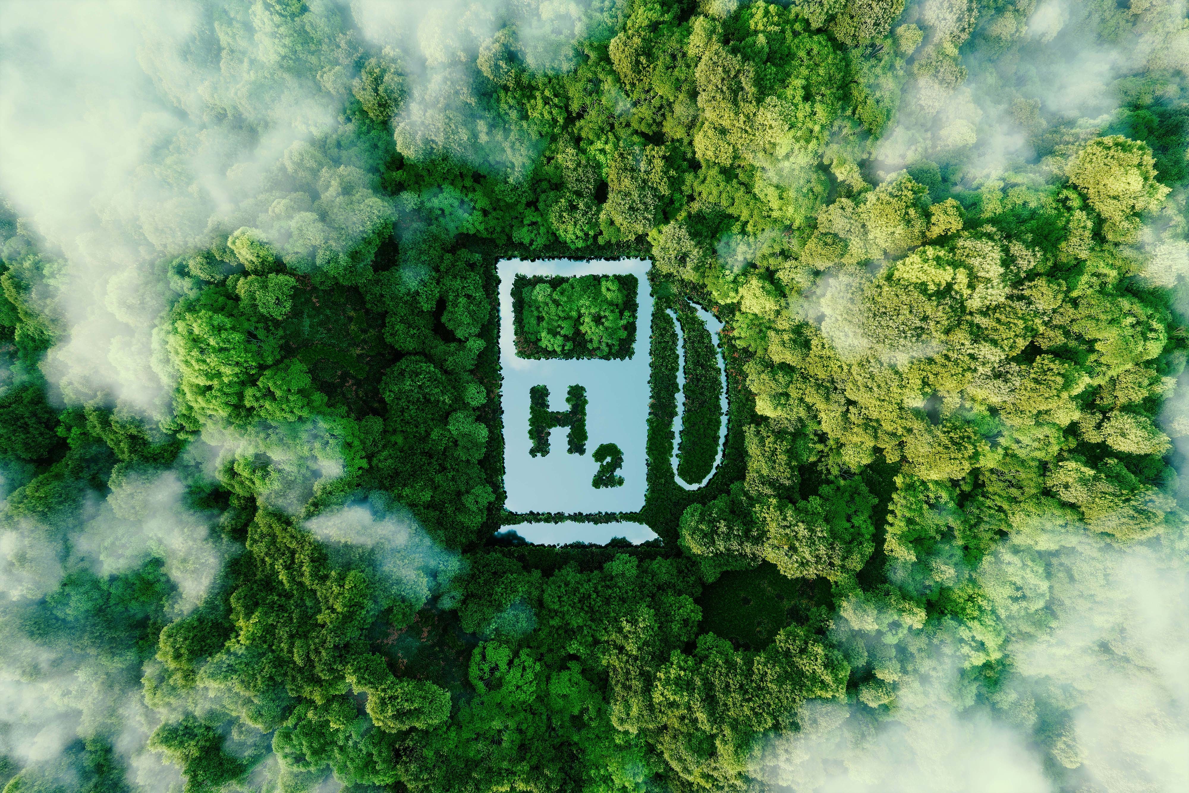


Shell are slowly migrating to cleaner energy. Hydrogen shows huge potential, but there are a number of challenges that need to be overcome first. I was hired by Shell as a Lead Product Designer, to work in a small cross disciplined team, incorporating a Product Owner, UX Researcher, Business Analyst, Front End Engineer, and Back End Engineer. Our task was to get under the surface of the hydrogen process, from extraction to vehicle consumption, and identify all of the different people involved, then surface and visualise all of the different types of data available, so that improvements and efficiencies could be made. This was an internal tools project for Shell.

- Information gathering
- Internal workshop
- Processing our findings
- Personas
- Research
- Planning
- Data
- Structure
- Event types
- Where to focus
- Moodboard
- Mobile design
- Desktop design
- Prototyping
- Outcome


The Process
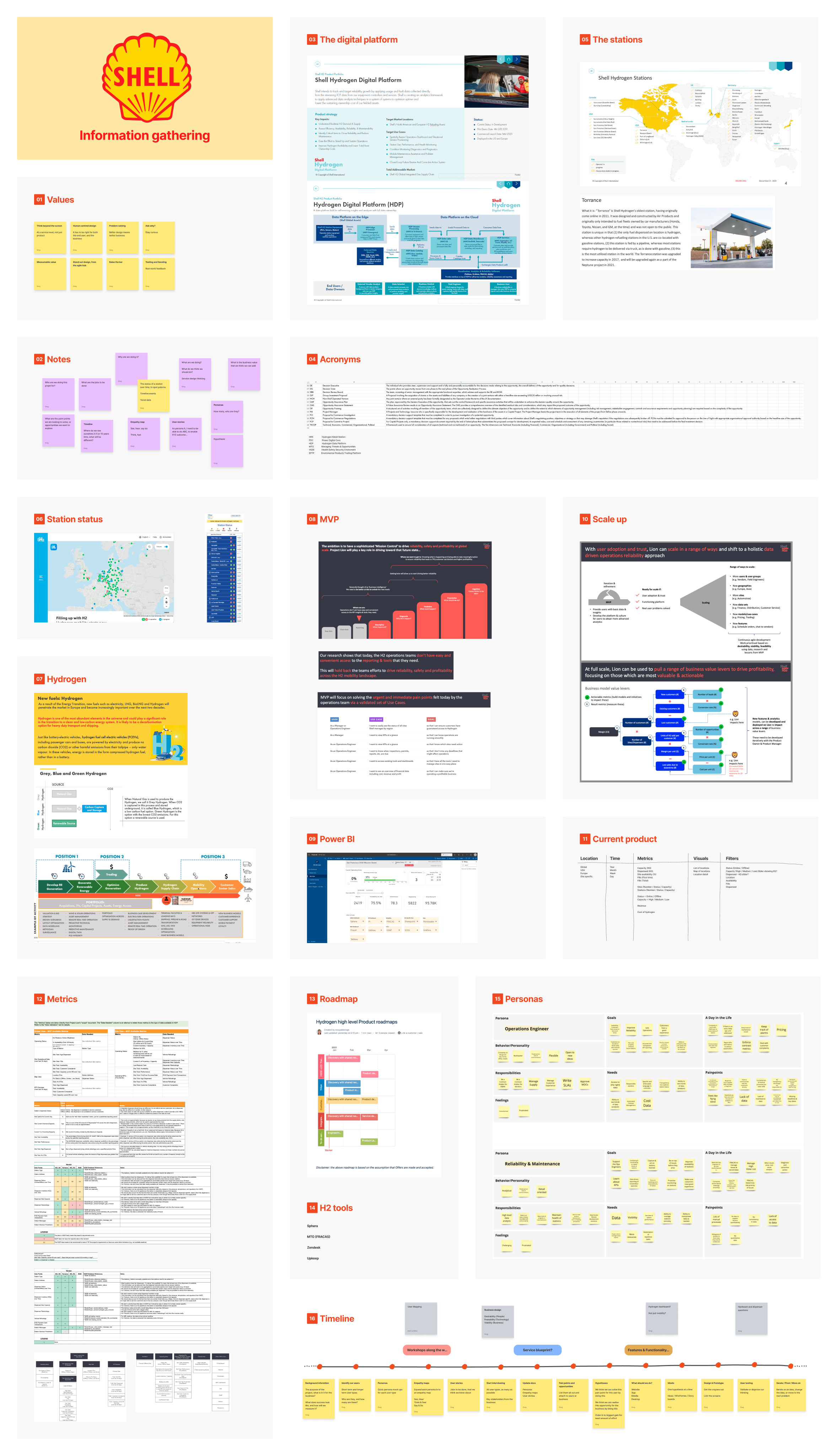
Information gathering
Our first job was to gather all of the information we could find about Shell’s involvement in hydrogen, and onboard ourselves as quickly as possible.
Internal workshop
We then had an internal workshop where we discussed our learnings, understanding, assumptions, and questions.
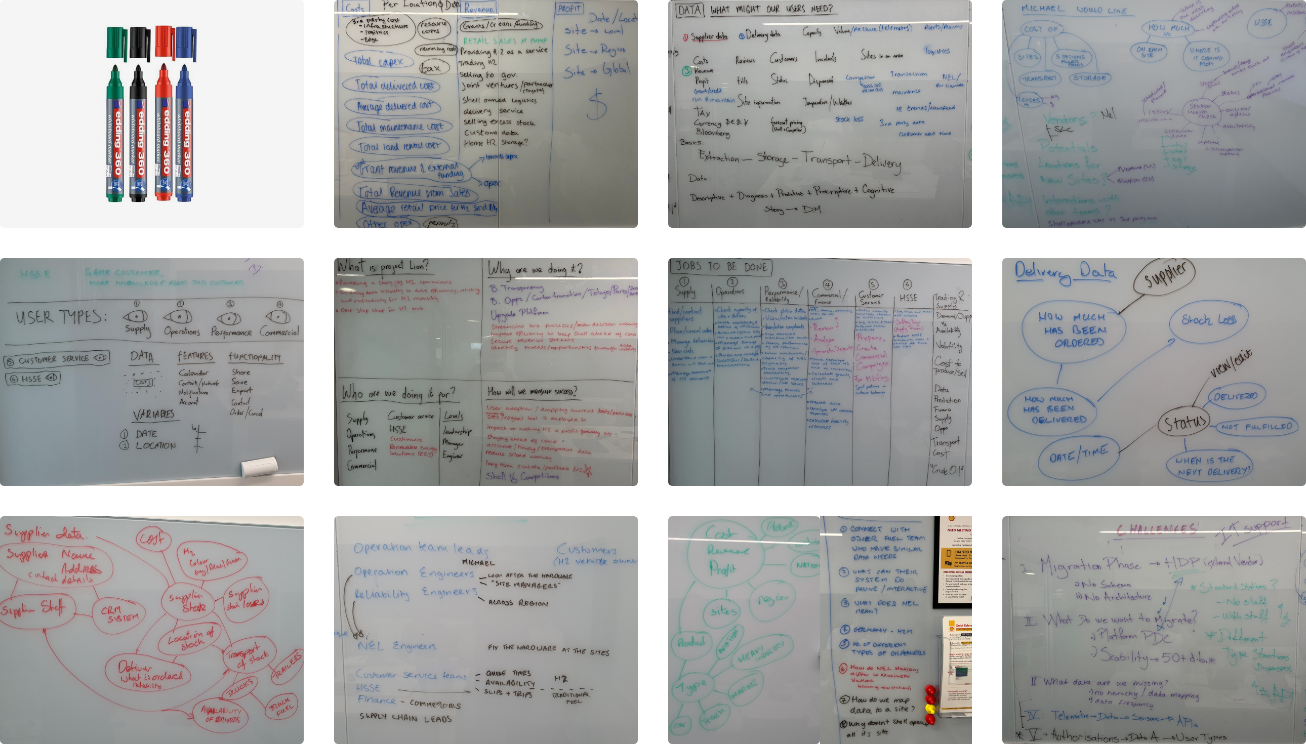
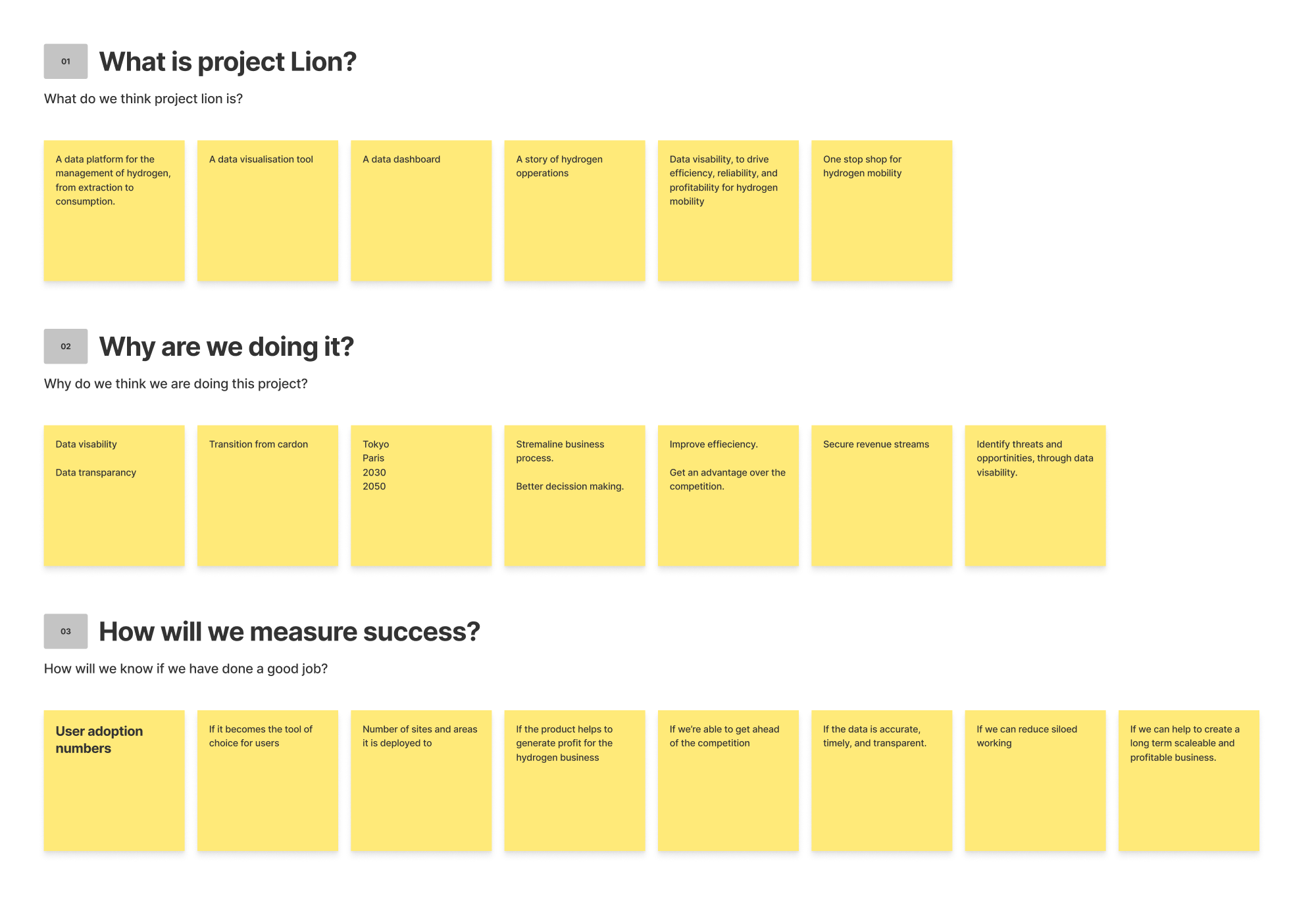
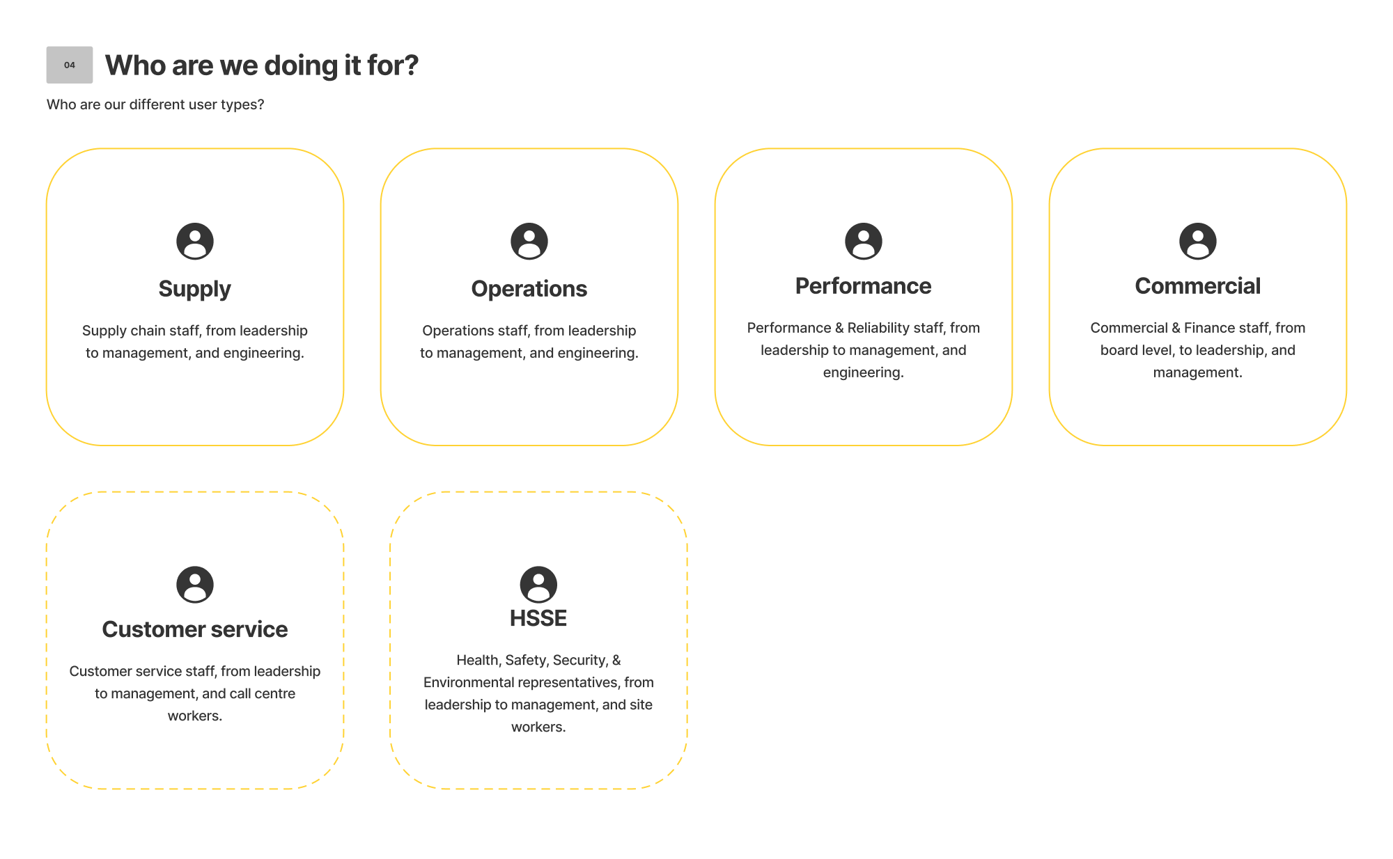
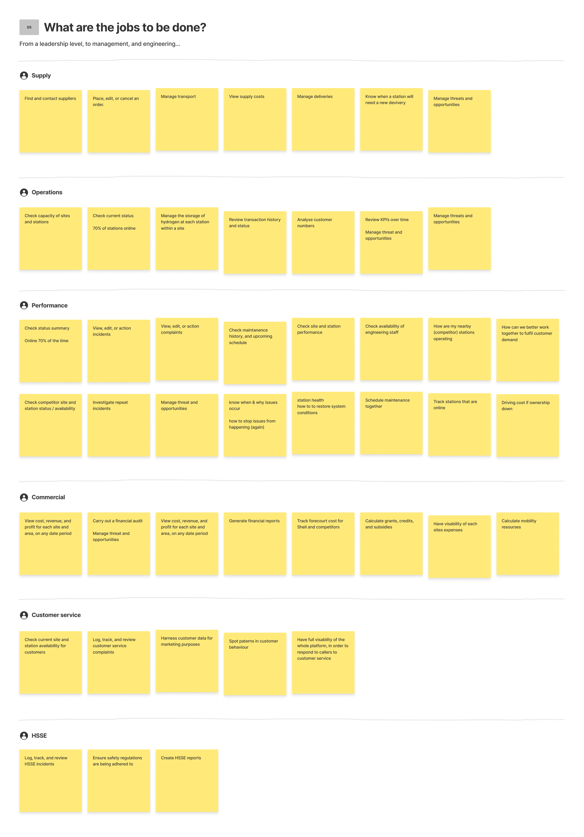
Processing our findings
We then processed our workshop findings on to a FigJam board. These findings included what we are doing, who we are doing it for, why we are doing it, what are the jobs to be done, and how we will measure success.
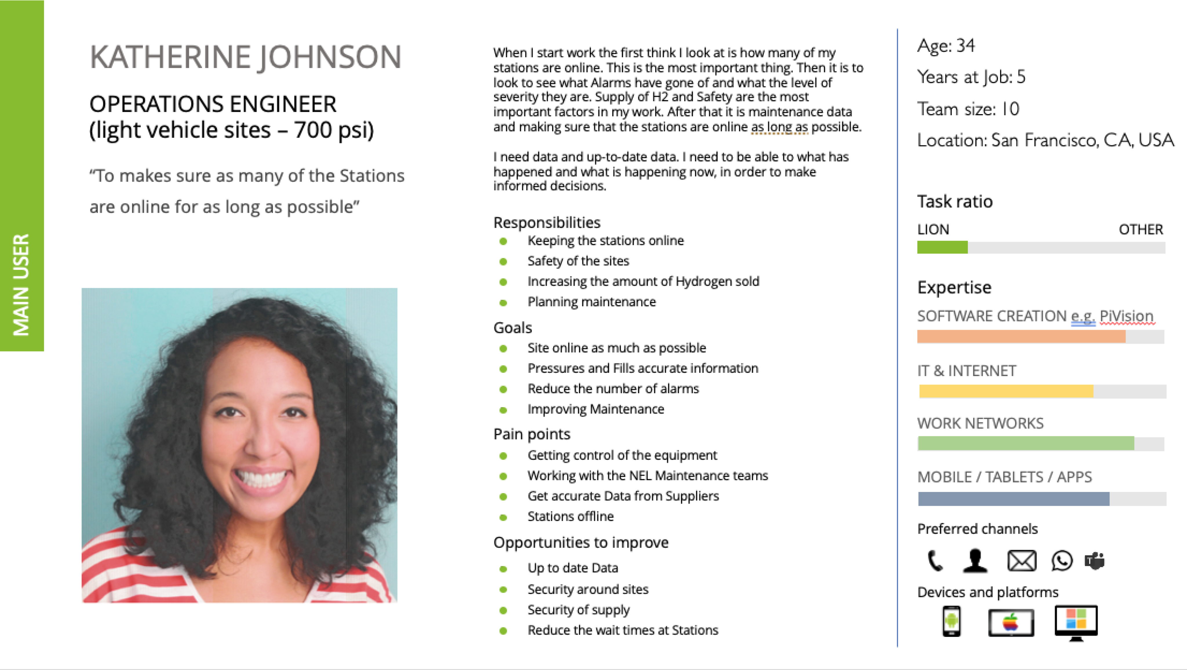
Personas
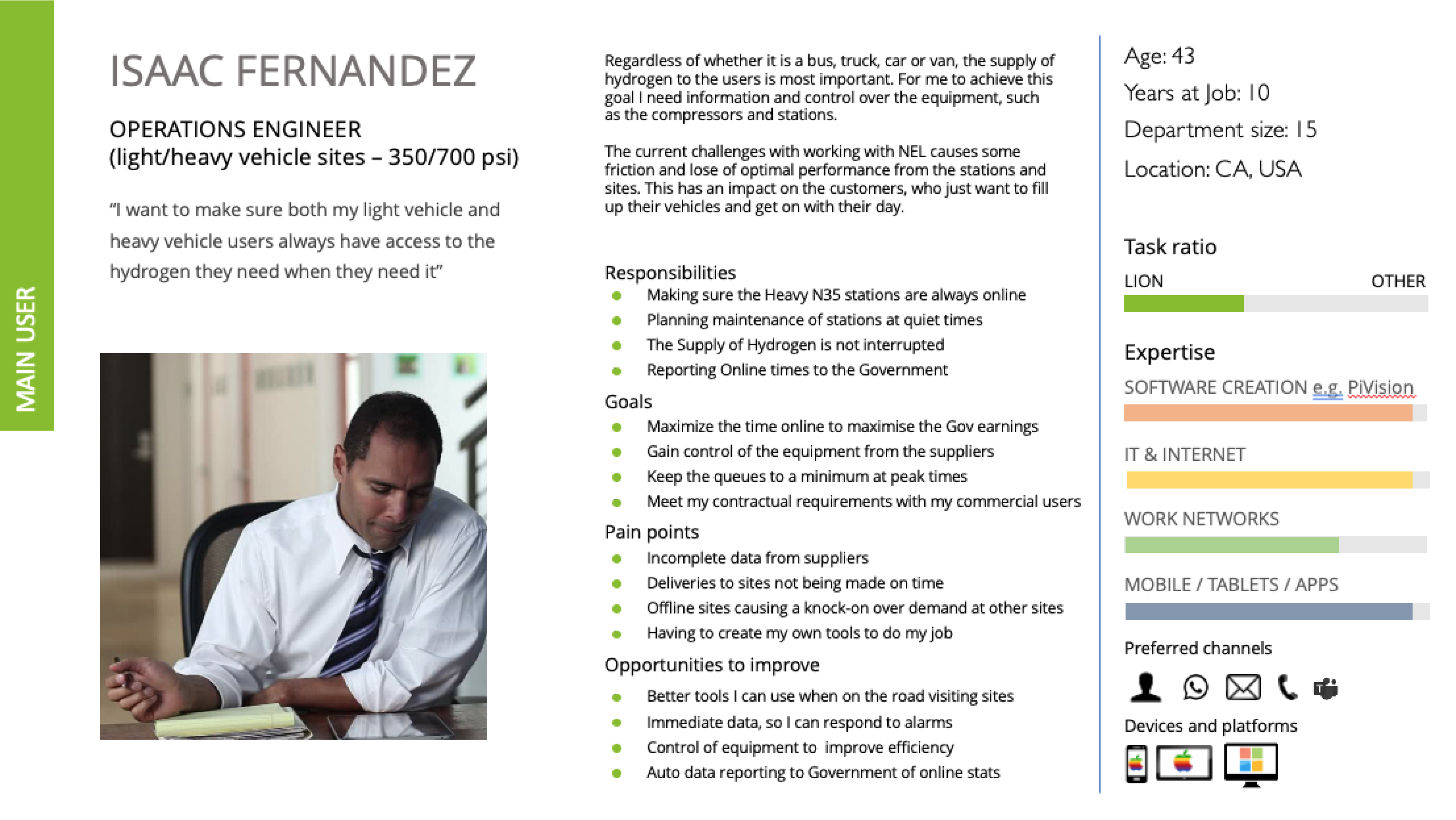
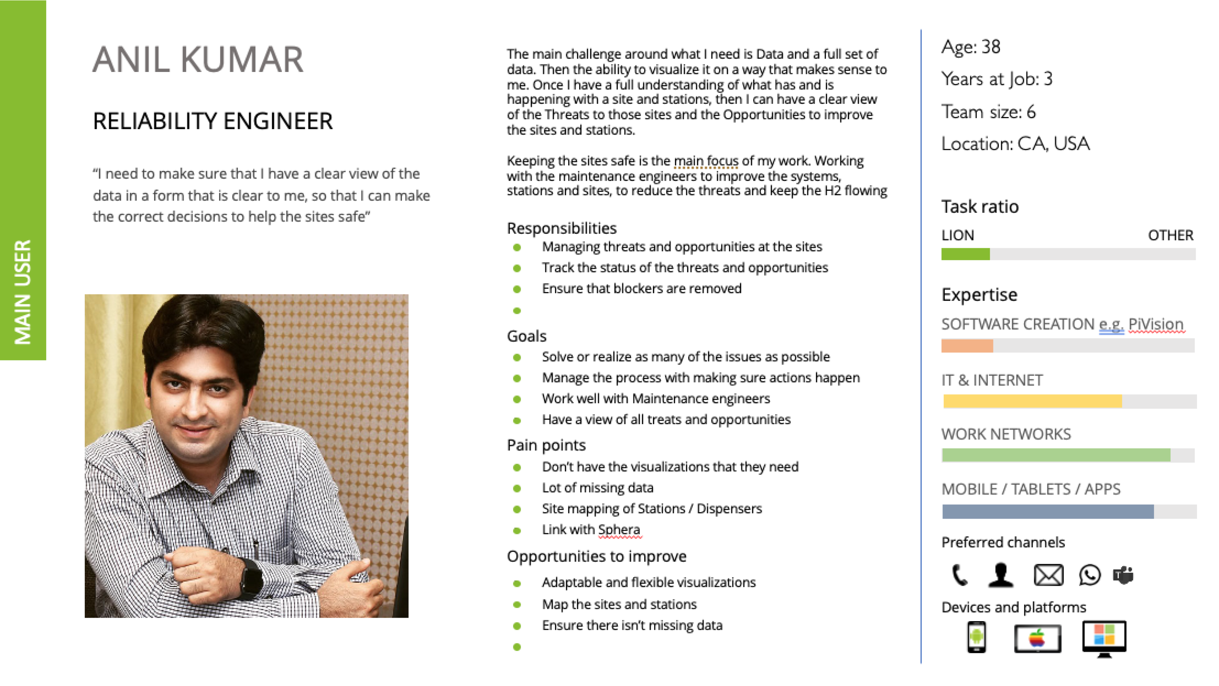
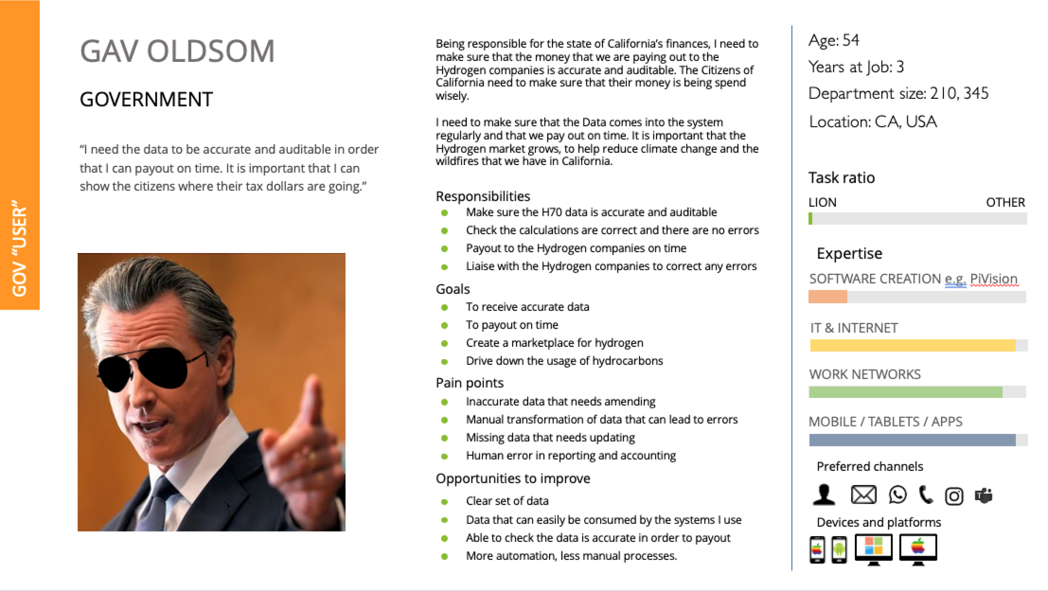
Next, our UX Researcher put together a few personas that could be shared with our stakeholders.
Research
Early research was then carried out on a number of internal users working in the hydrogen space.
Planning
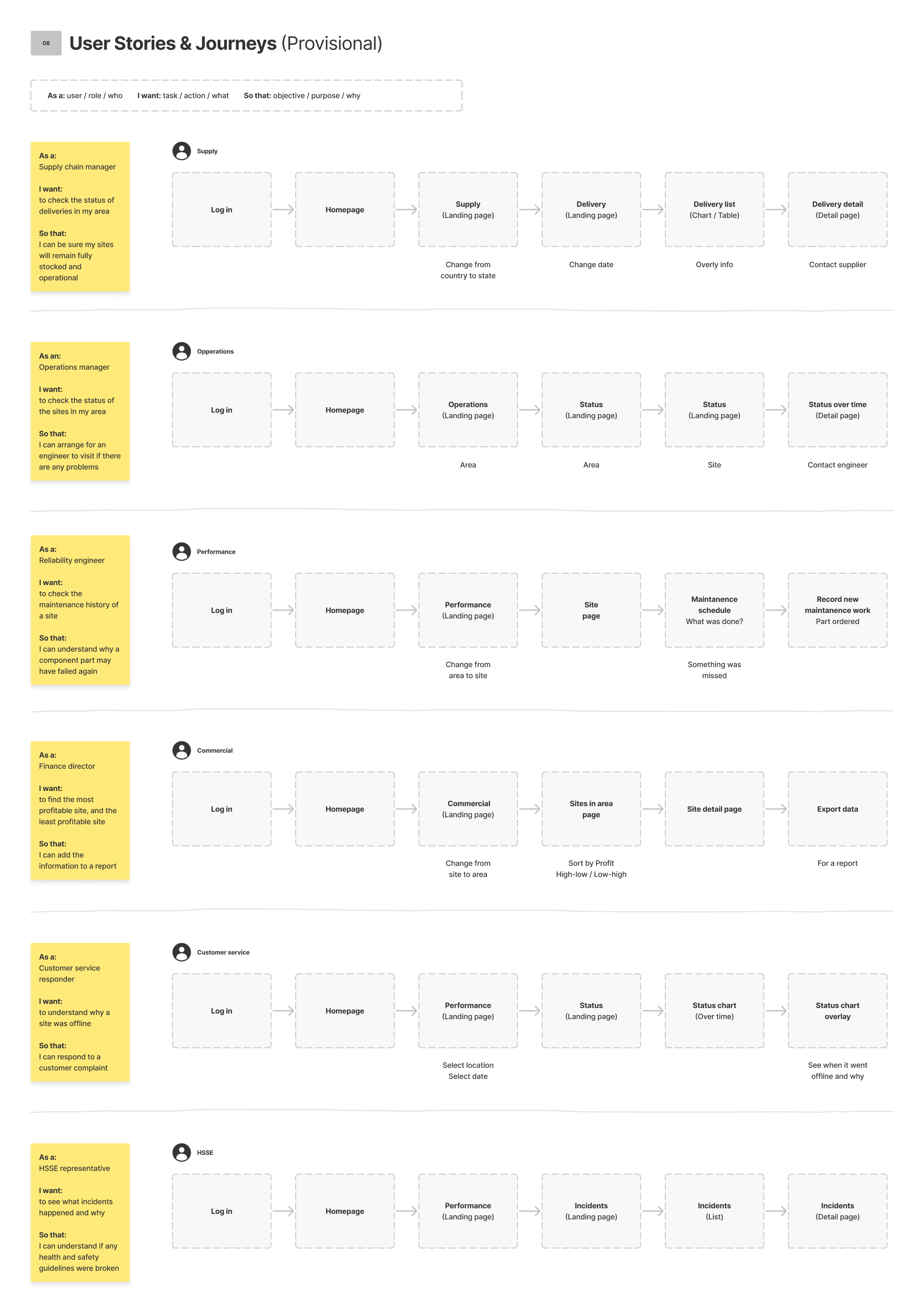
Next, we started to plan what our different user types might need to do, and why.
We then mapped out provisional steps that might be needed in order to perform each task.
Data
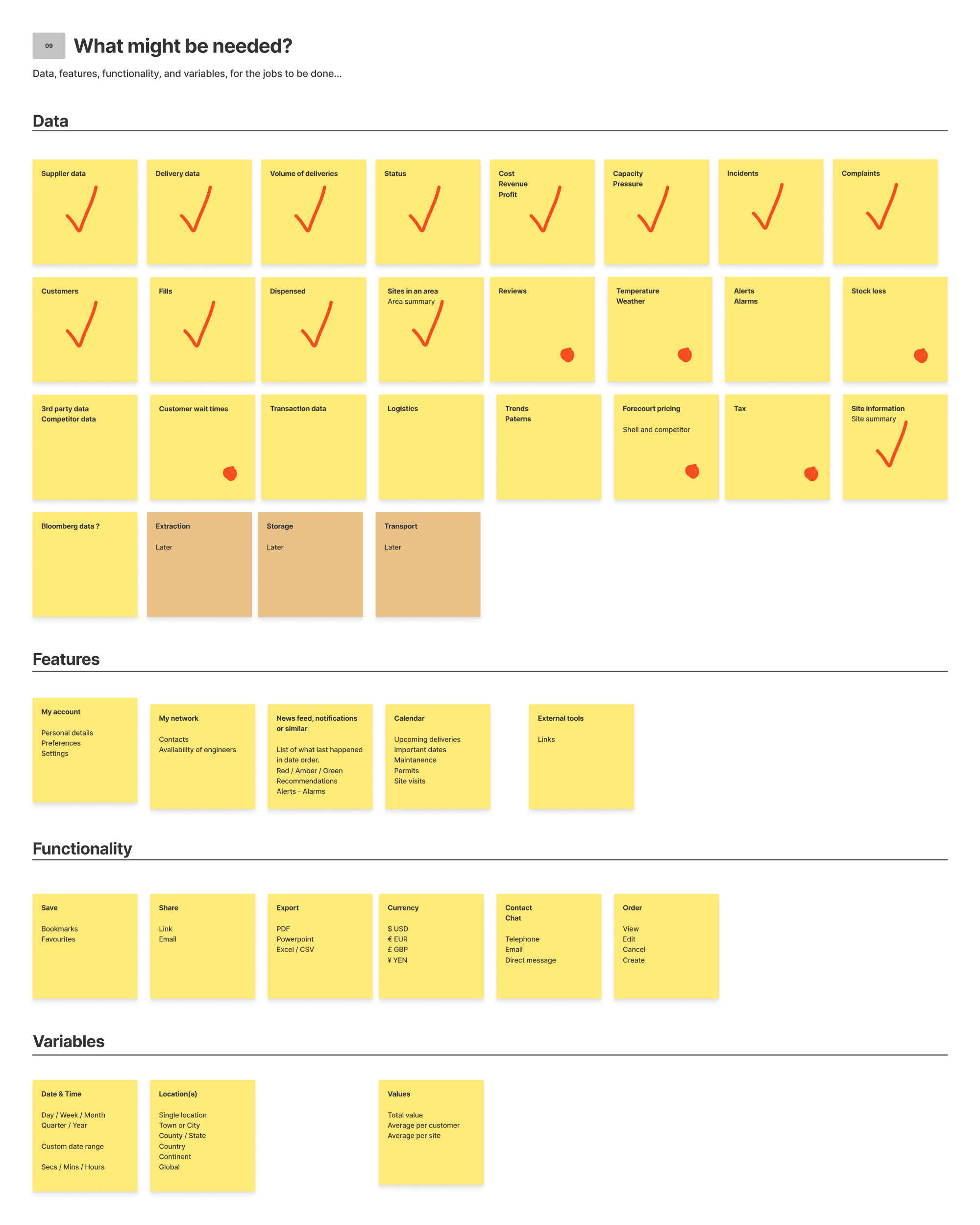
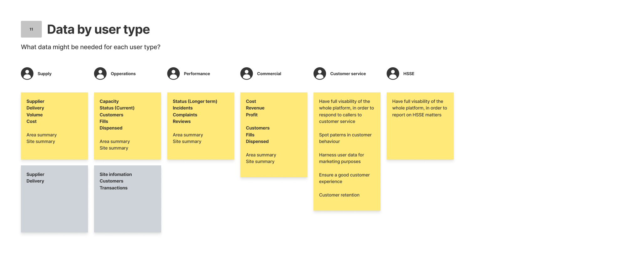
Data was a massive part of this project, so we then began to start listing out every different data type that we could think of within the hydrogen process. We then listed out the different features and functionality that we might need, along with our key variables, such as location and date. After that we started grouping data in to categories, and then in to user types.
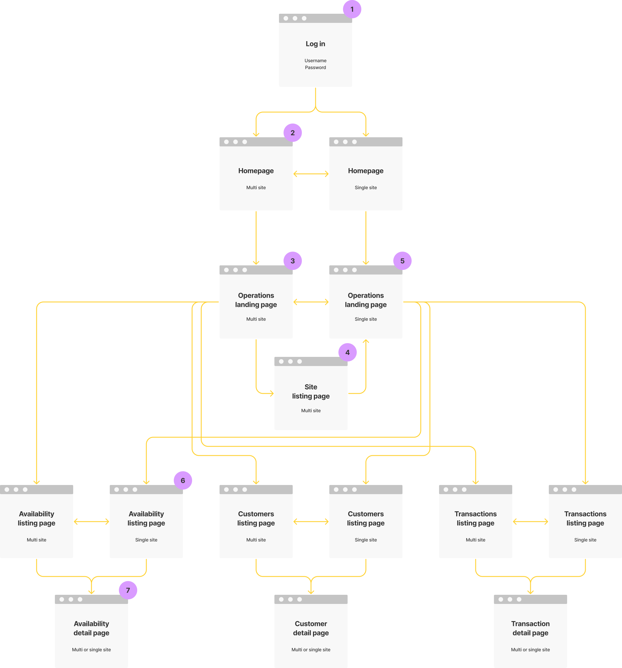
Structure
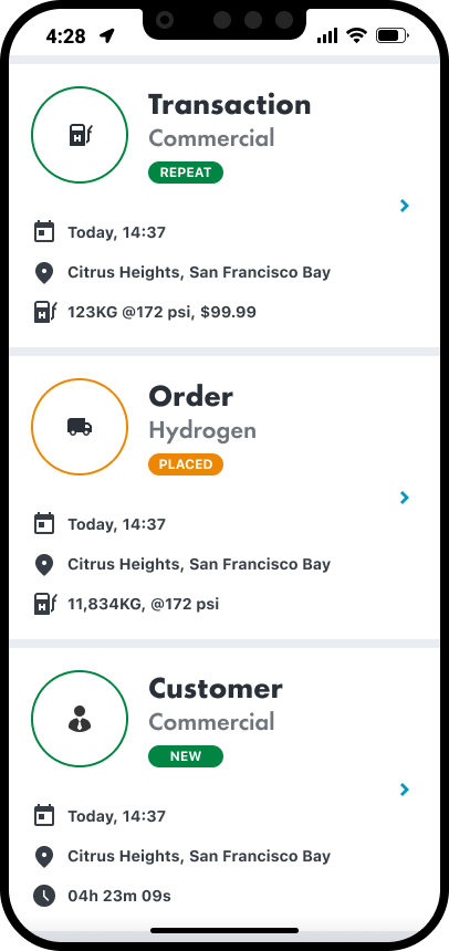
Next we started to think about how all of this might be structured. We came up with four main sections, and the example here is for Operations.
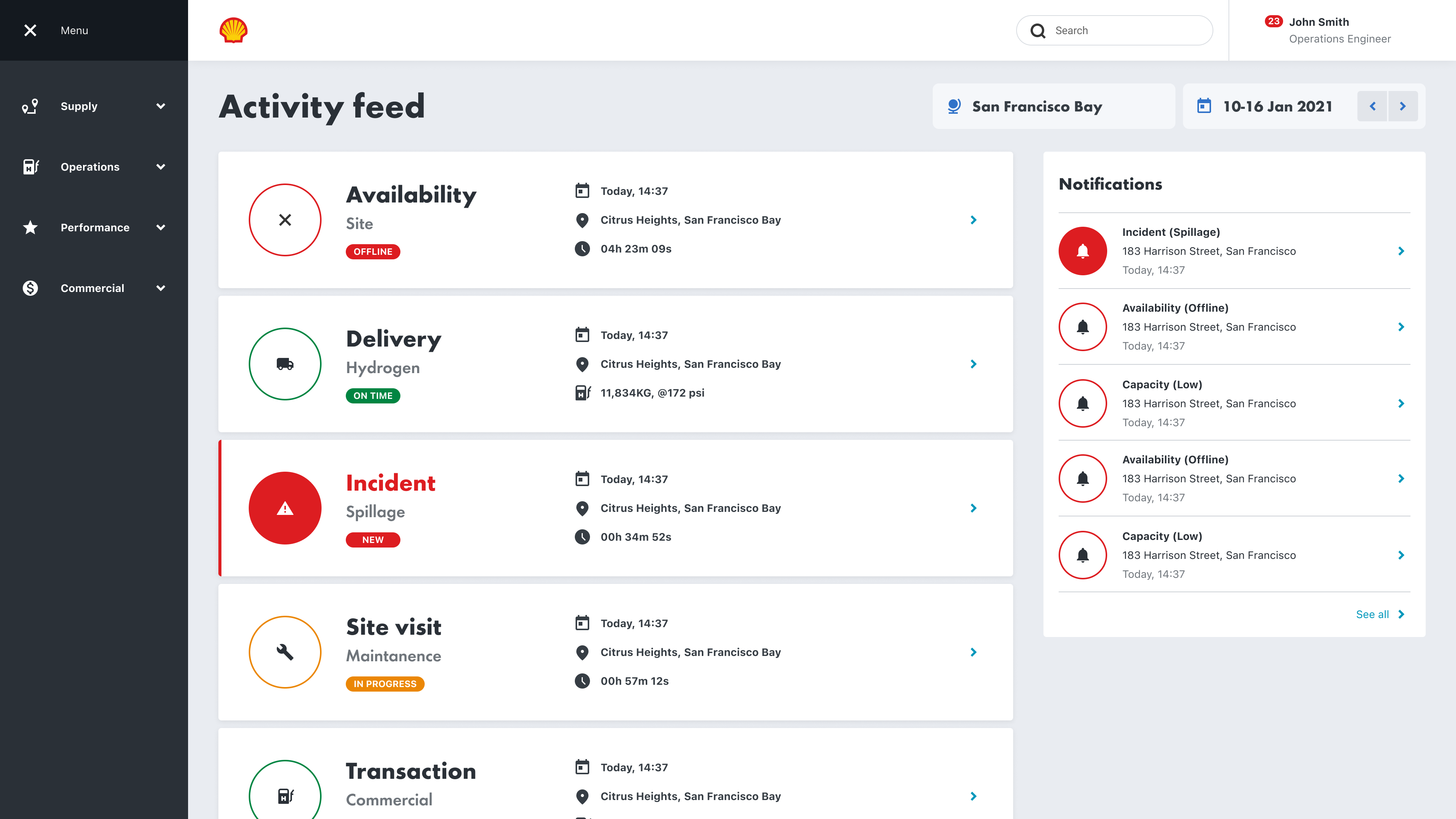
Operations
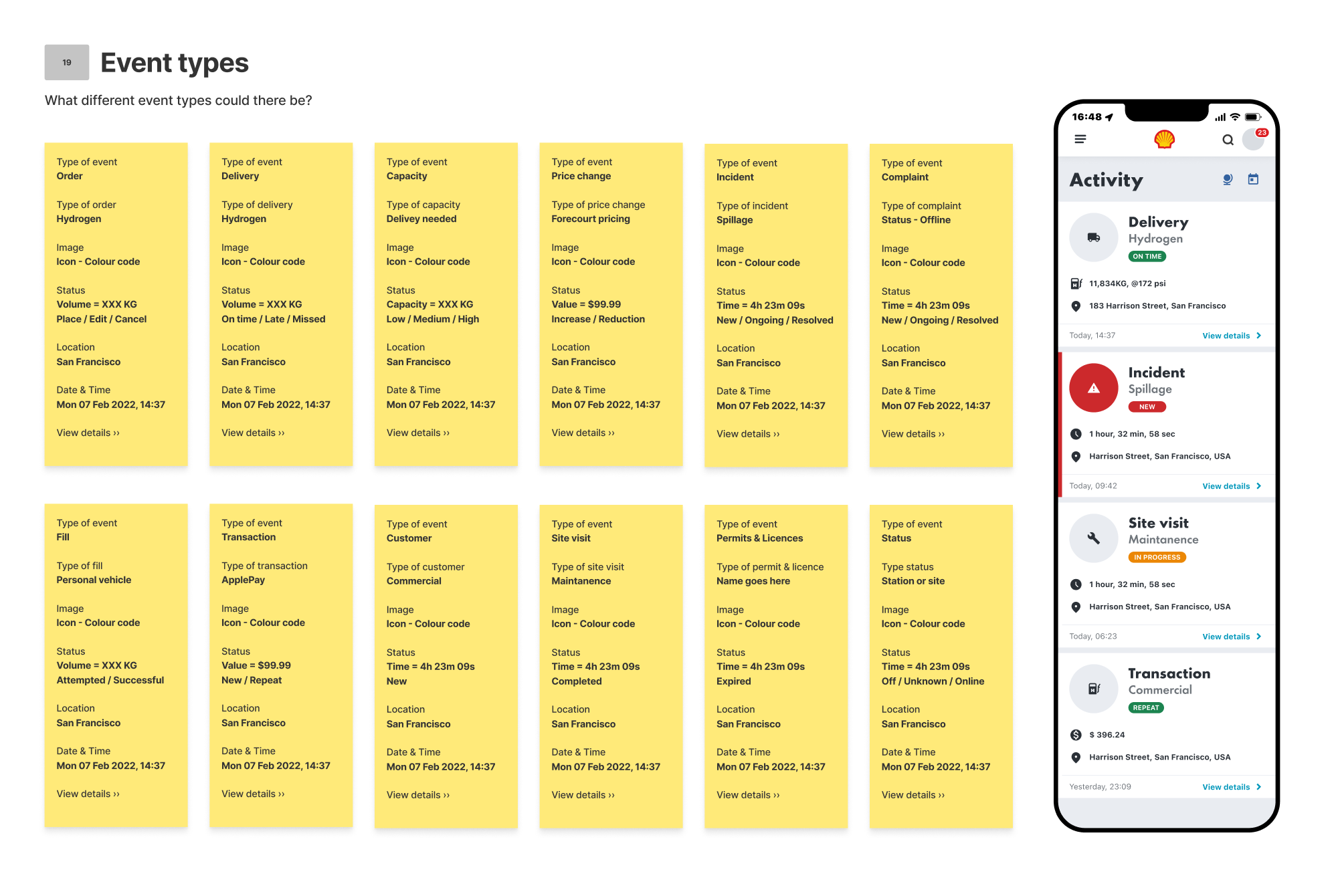
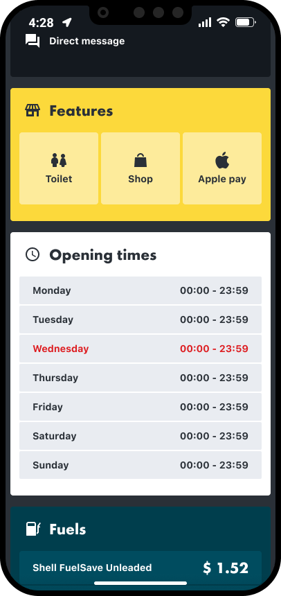
Event types
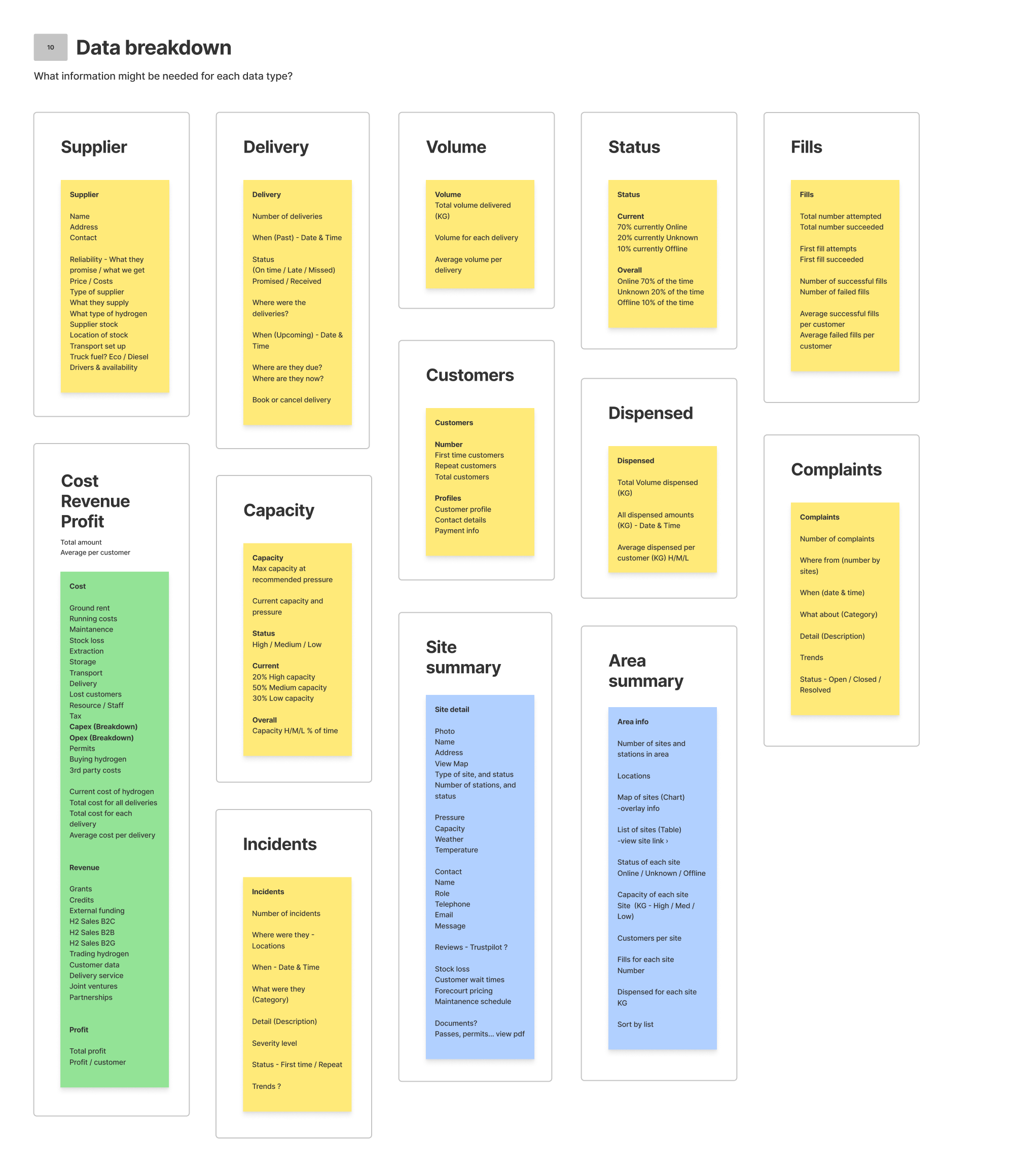
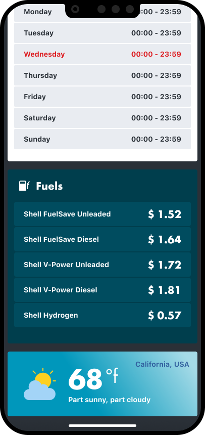
As well as different data types, there are also a lot of different event types. We had to identify all of the different event types and create a uniform formula to display them, incorporation the different variables, such as location, date, volume, price, type, and status.
Where to focus
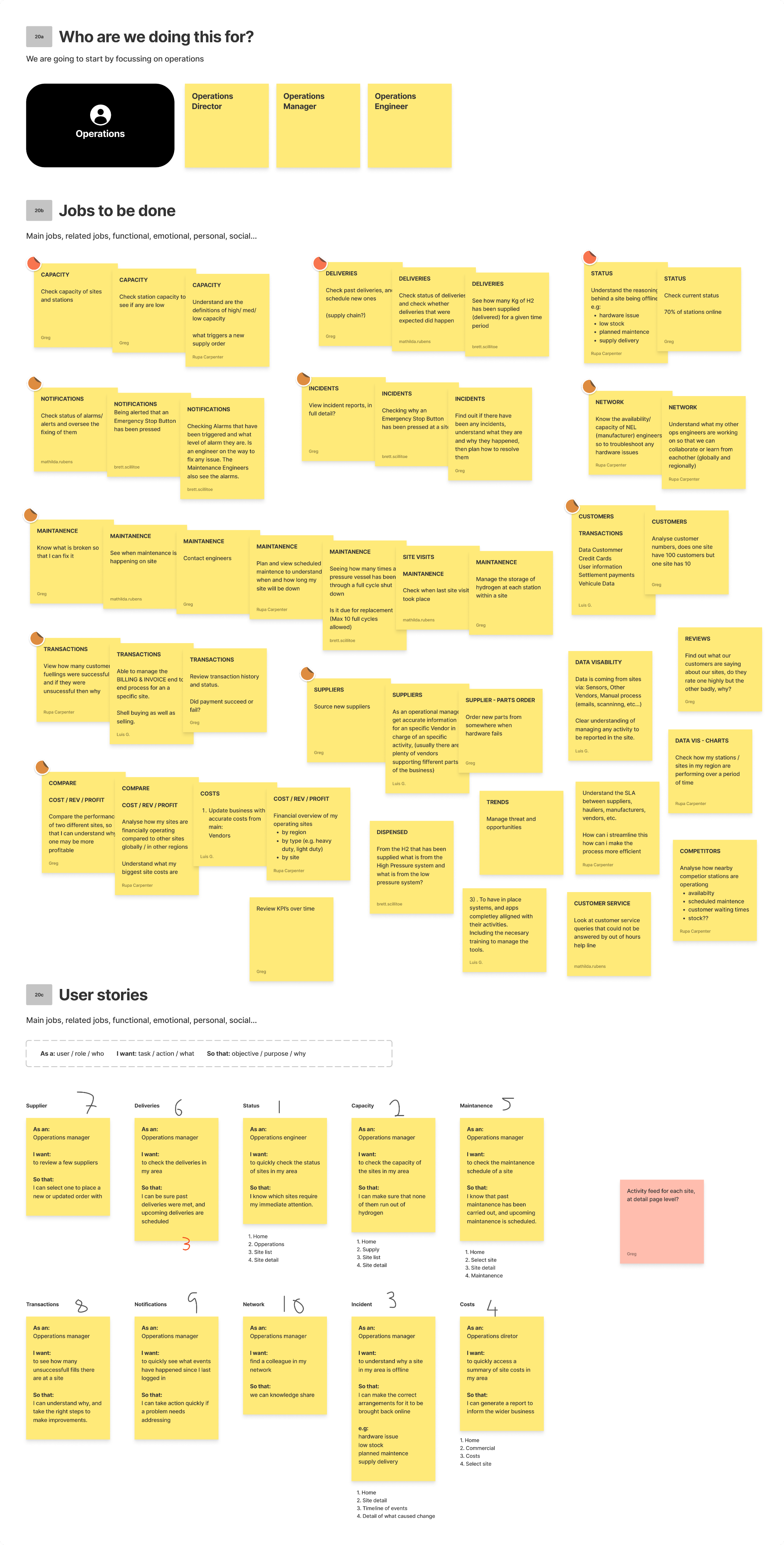
We then needed to focus, so we chose operations to begin with. We identified Operations Directors, Operations Managers, and Operations Engineers as our primary user group. We then identified all of their jobs to be done.

A mood-board was created next, as extra inspiration to go along with the already established Shell Design System.

Navigation & filtering
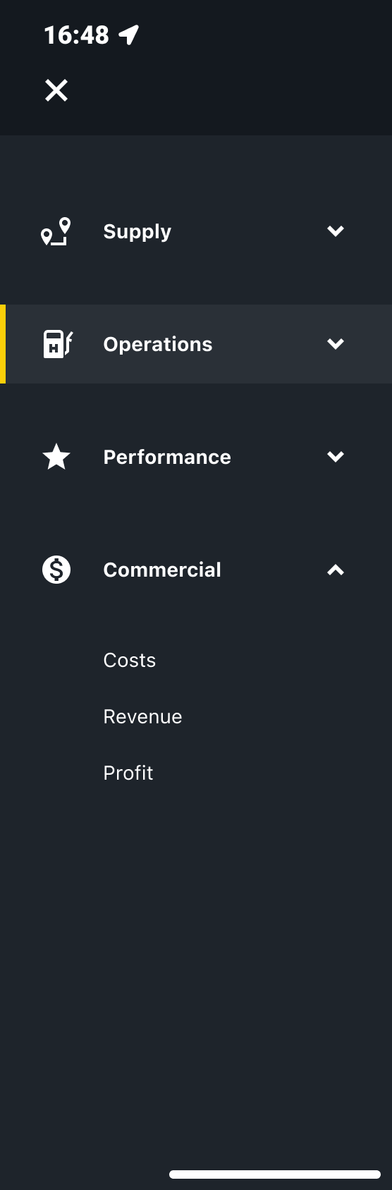
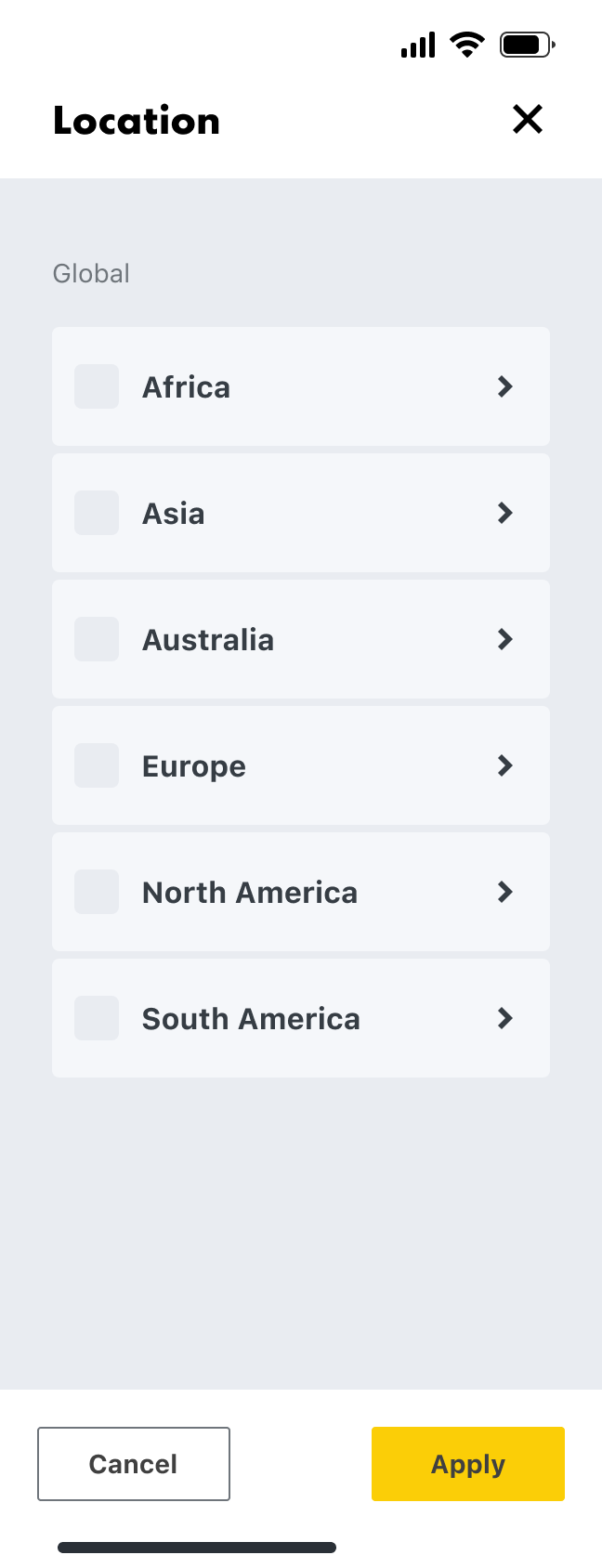
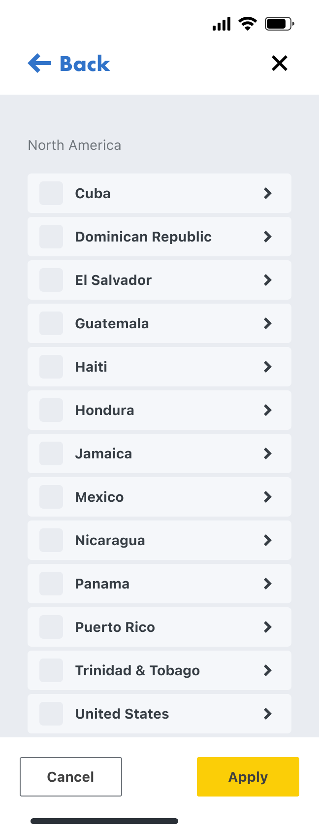
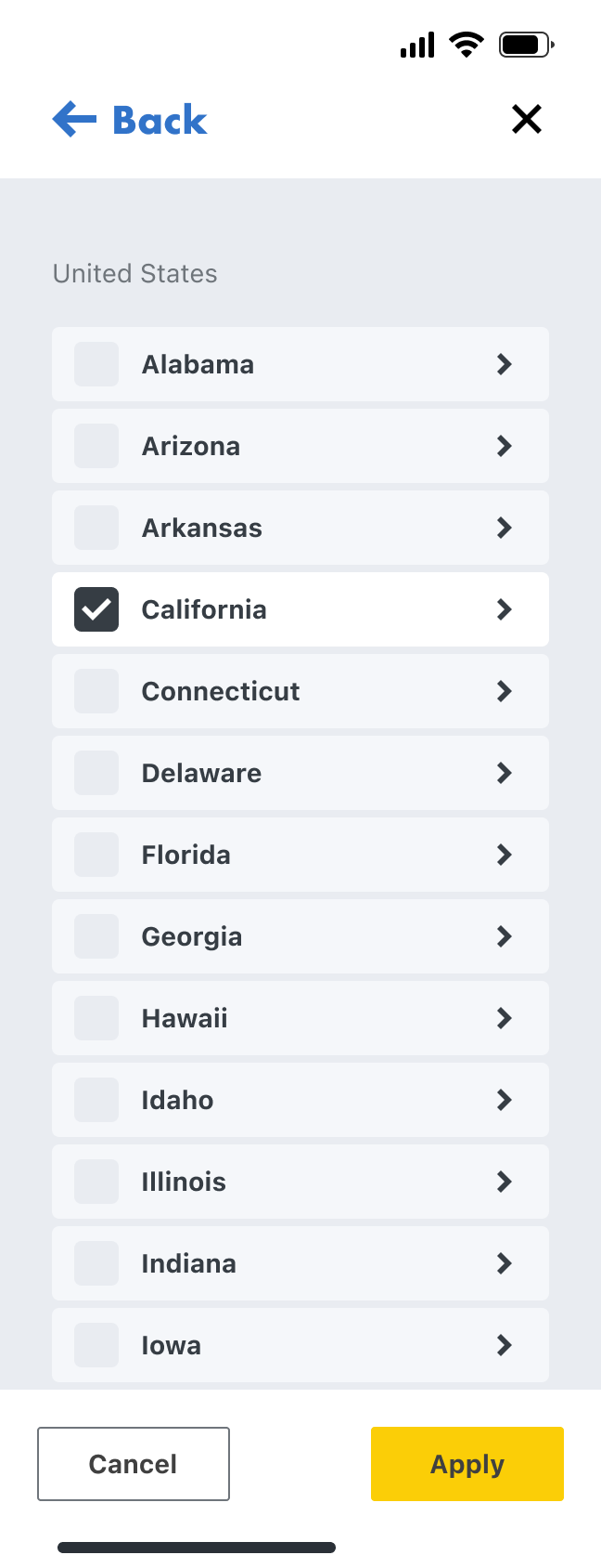
The navigation followed the needs of our four main user types; Supply, Operations, Performance, and Commercial, with the categories reflectiong their jobs to be done.
Navigation
Location
Date
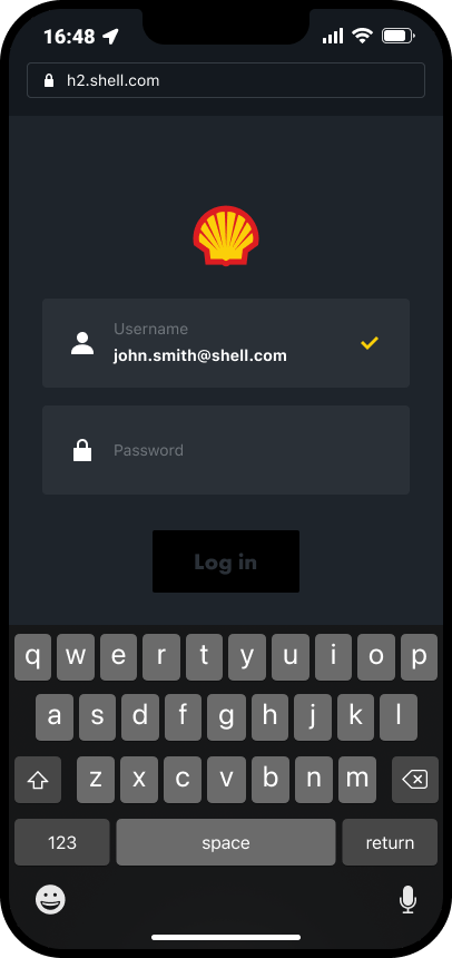
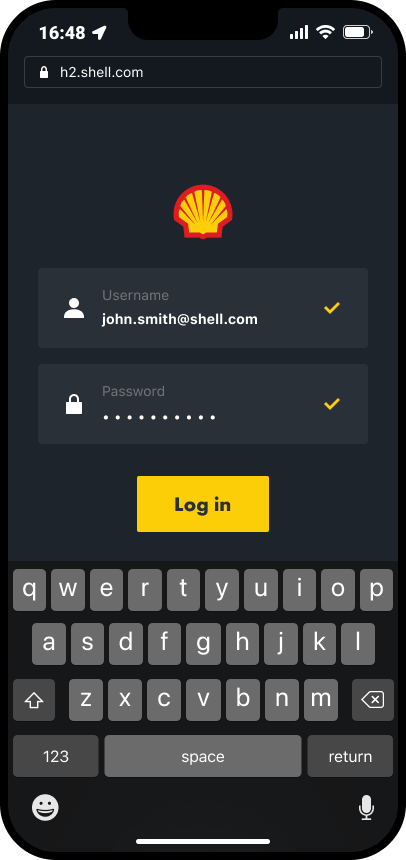
Mobile screens
Once we had the fundamentals in place we focussed on the mobile screens first, as a large number of our users will be out of the office and travelling between hydrogen sites, so quick and easy access is needed to the available data.
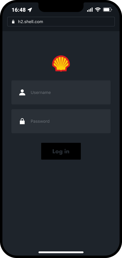
Log in
Homepage
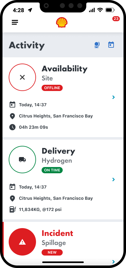
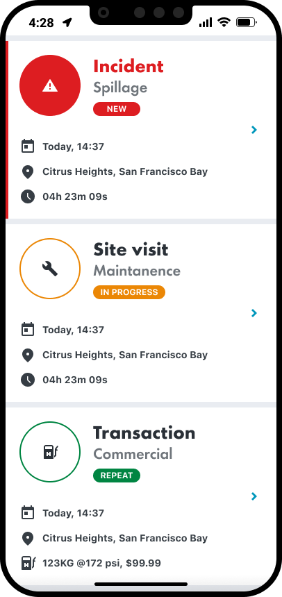
Operations
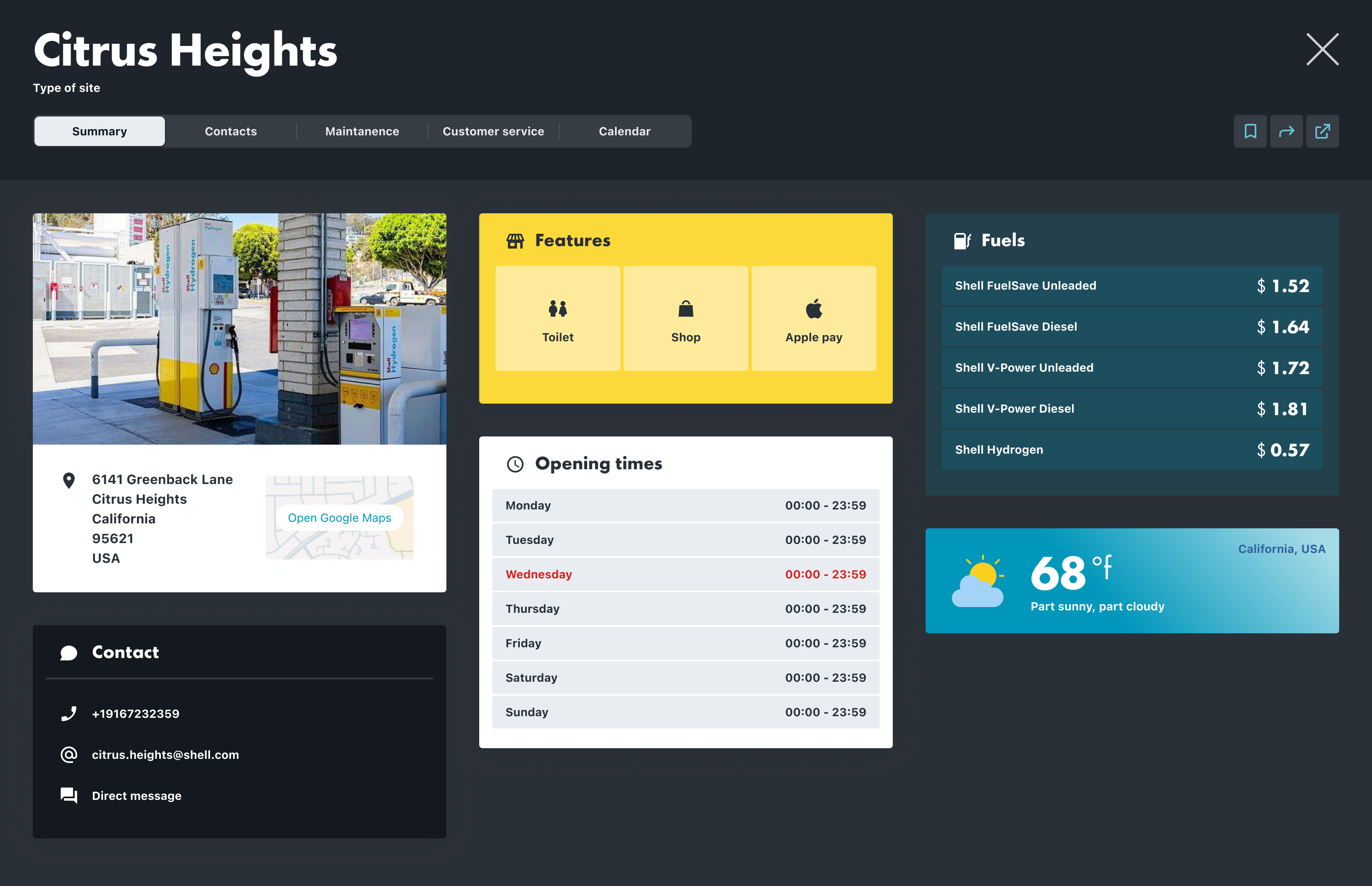
Site info
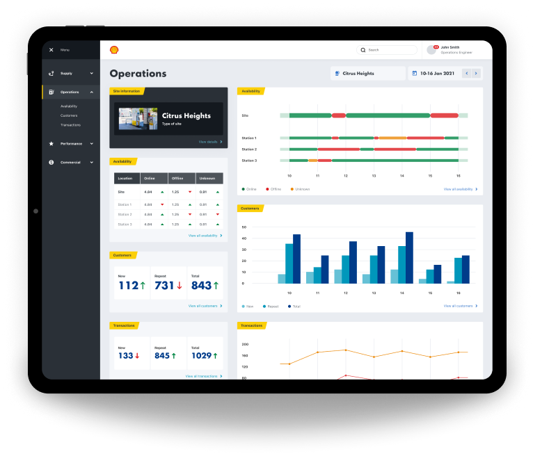
Desktop screens
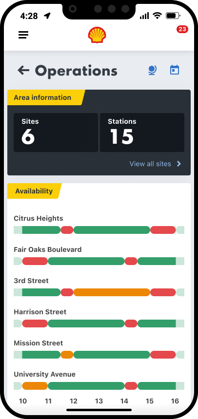
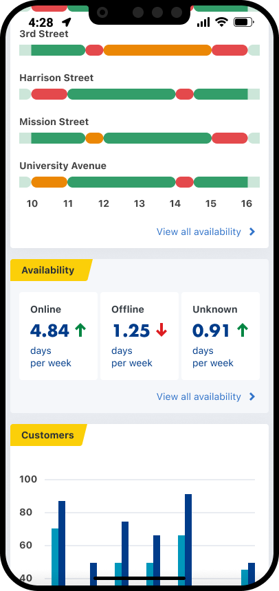
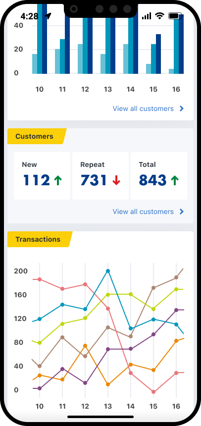
The desktop screens were our next focus, for our users that analyse data predominantly from an office space.
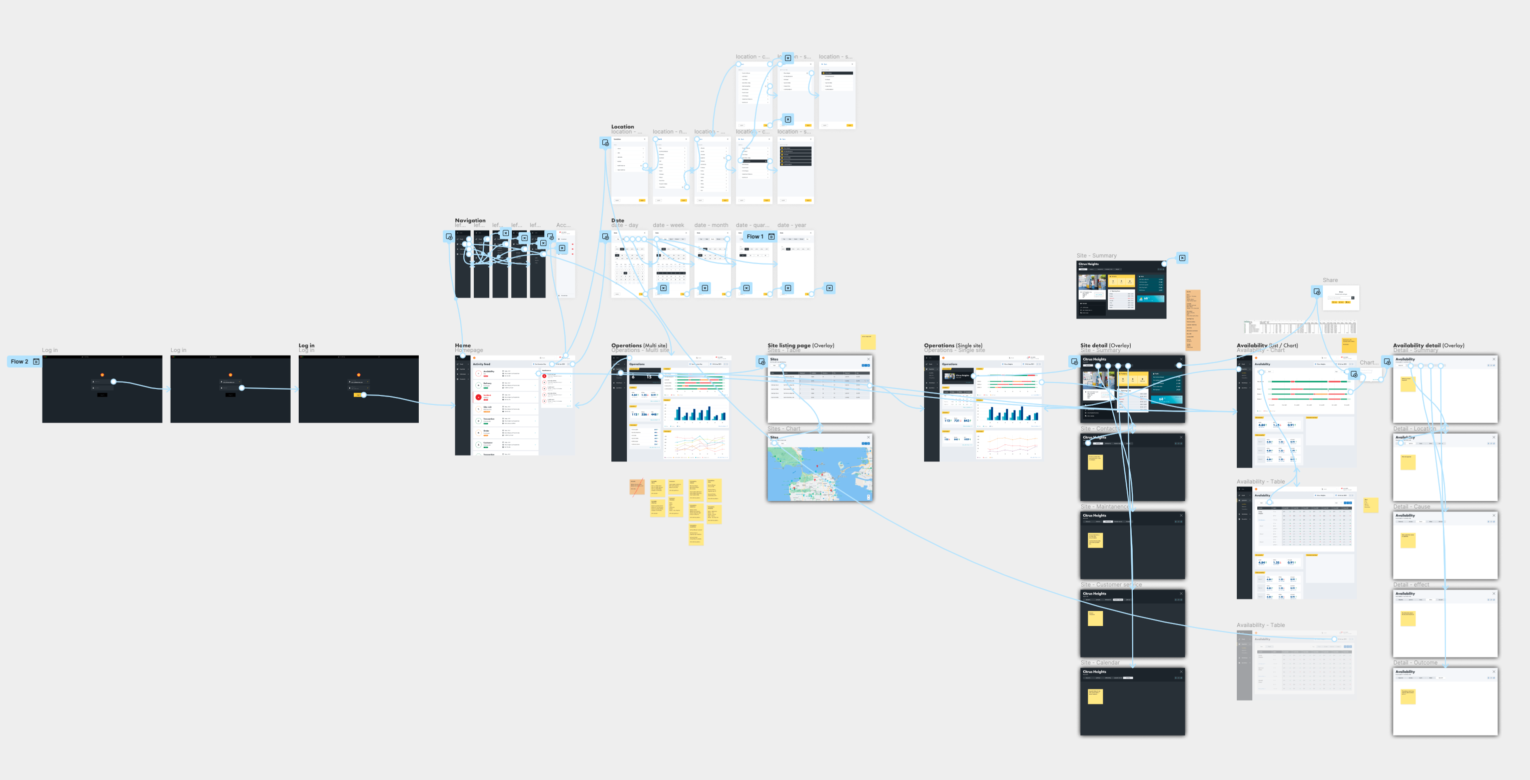
Prototyping
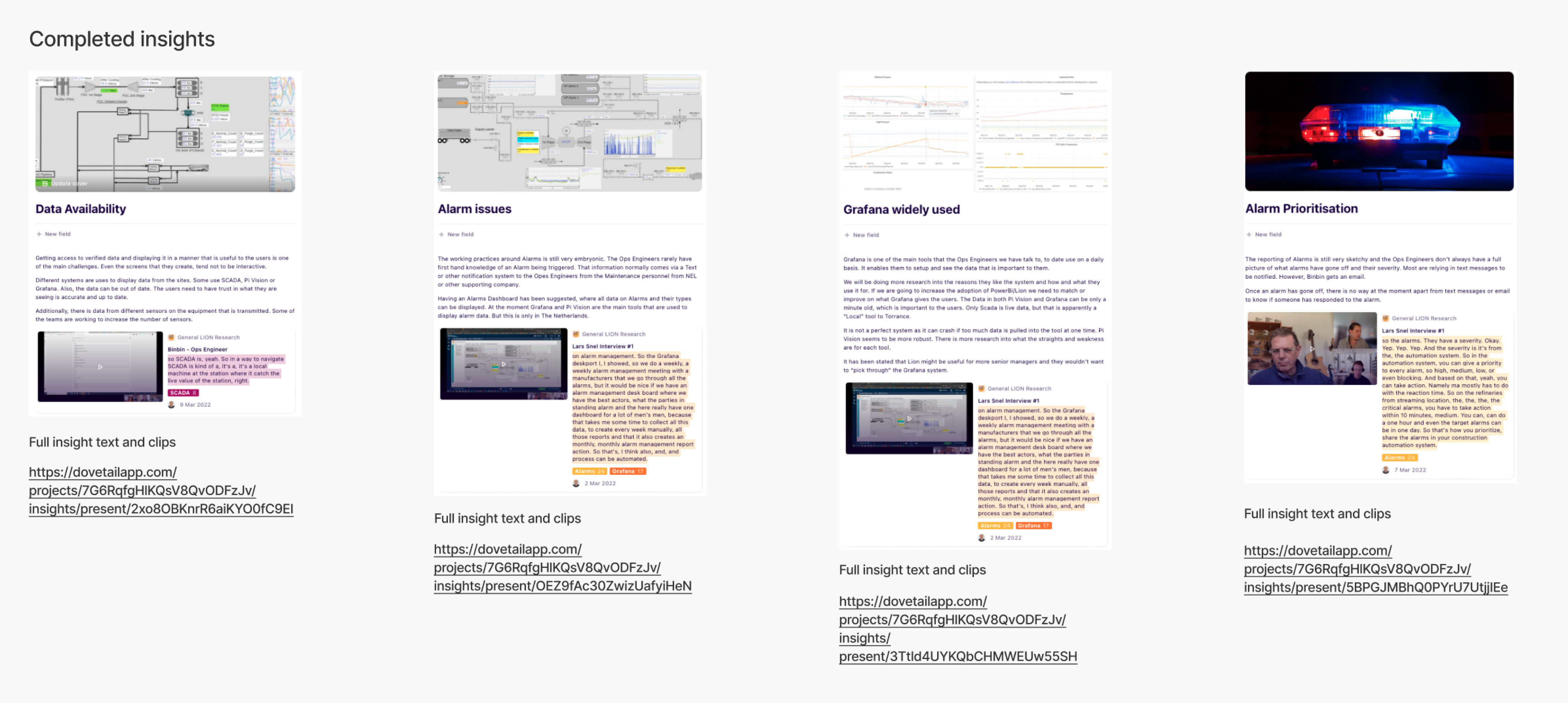
We did as many quick and dirty prototypes as possible, testing them each time via video calls with different Shell employees that work in the hydrogen space, and then uploading each video to Dovetail to be processed.
Outcome
The proof of concept delivered significant value for our users. They were genuinely excited about how the software we were building could simplify their workflows and make their jobs far more efficient.
However, we identified gaps in the data we wanted to expose, as well as inconsistencies in its sources. Some data feeds were not yet fully established, which meant the information wasn’t always accurate or reliable. Because of this, we decided to pivot and focus on securing more complete and trustworthy data sources.
Despite the change in direction, it was a fantastic project to be part of—supporting Shell’s transition toward cleaner energy.
Industry
Energy
Product
Internal tools
Shell
Shell are slowly migrating to cleaner energy. Hydrogen shows huge potential, but there are a number of challenges that need to be overcome first. I was hired by Shell as a Lead Product Designer, to work in a small cross disciplined team, incorporating a Product Owner, UX Researcher, Business Analyst, Front End Engineer, and Back End Engineer. Our task was to get under the surface of the hydrogen process, from extraction to vehicle consumption, and identify all of the different people involved, then surface and visualise all of the different types of data available, so that improvements and efficiencies could be made. This was an internal tools project for Shell.
- Information gathering
- Internal workshop
- Processing our findings
- Personas
- Research
- Planning
- Data
- Structure
- Event types
- Where to focus
- Moodboard
- Mobile design
- Desktop design
- Prototyping
- Outcome


The Process
Information gathering
Our first job was to gather all of the information we could find about Shell’s involvement in hydrogen, and onboard ourselves as quickly as possible.
Internal workshop
We then had an internal workshop where we discussed our learnings, understanding, assumptions, and questions.
Processing our findings
We then processed our workshop findings on to a FigJam board. These findings included what we are doing, who we are doing it for, why we are doing it, what are the jobs to be done, and how we will measure success.
Personas
Next, our UX Researcher put together a few personas that could be shared with our stakeholders.
Research
Early research was then carried out on a number of internal users working in the hydrogen space.
Planning
Next, we started to plan what our different user types might need to do, and why. We then mapped out provisional steps that might be needed in order to perform each task.
Data
Data was a massive part of this project, so we then began to start listing out every different data type that we could think of within the hydrogen process. We then listed out the different features and functionality that we might need, along with our key variables, such as location and date. After that we started grouping data in to categories, and then in to user types.
Structure
Next we started to think about how all of this might be structured. We came up with four main sections, and the example here is for Operations.
Operations
Event types
As well as different data types, there are also a lot of different event types. We had to identify all of the different event types and create a uniform formula to display them, incorporation the different variables, such as location, date, volume, price, type, and status.
Where to focus
We then needed to focus, so we chose operations to begin with. We identified Operations Directors, Operations Managers, and Operations Engineers as our primary user group. We then identified all of their jobs to be done.

A mood-board was created next, as extra inspiration to go along with the already established Shell Design System.
Navigation & filtering
The navigation followed the needs of our four main user types; Supply, Operations, Performance, and Commercial, with the categories reflectiong their jobs to be done.
Navigation
Location
Date
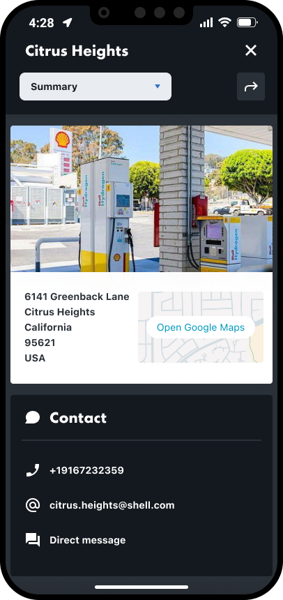
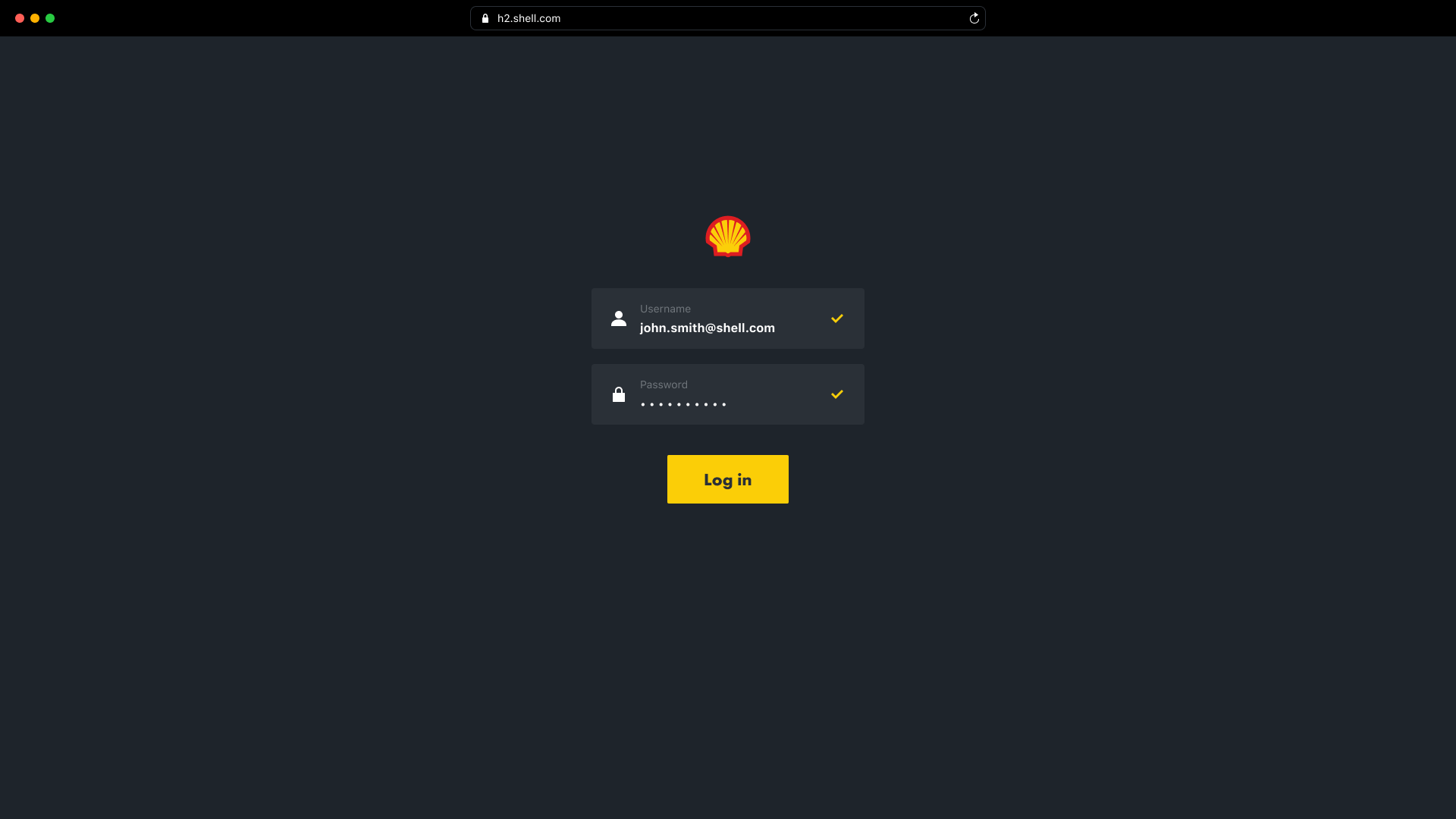
Mobile screens
Once we had the fundamentals in place we focussed on the mobile screens first, as a large number of our users will be out of the office and travelling between hydrogen sites, so quick and easy access is needed to the available data.
Log in
Homepage
Operations
Site info
Desktop screens
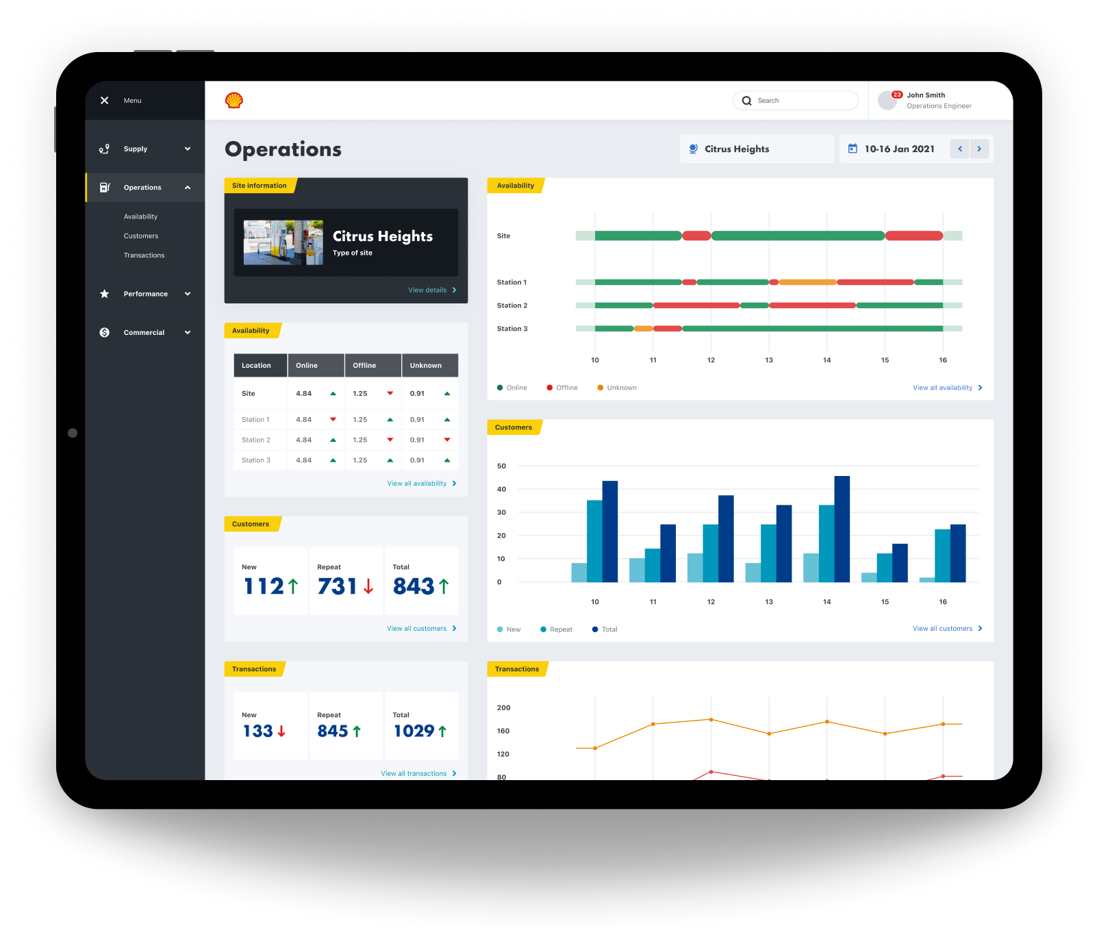
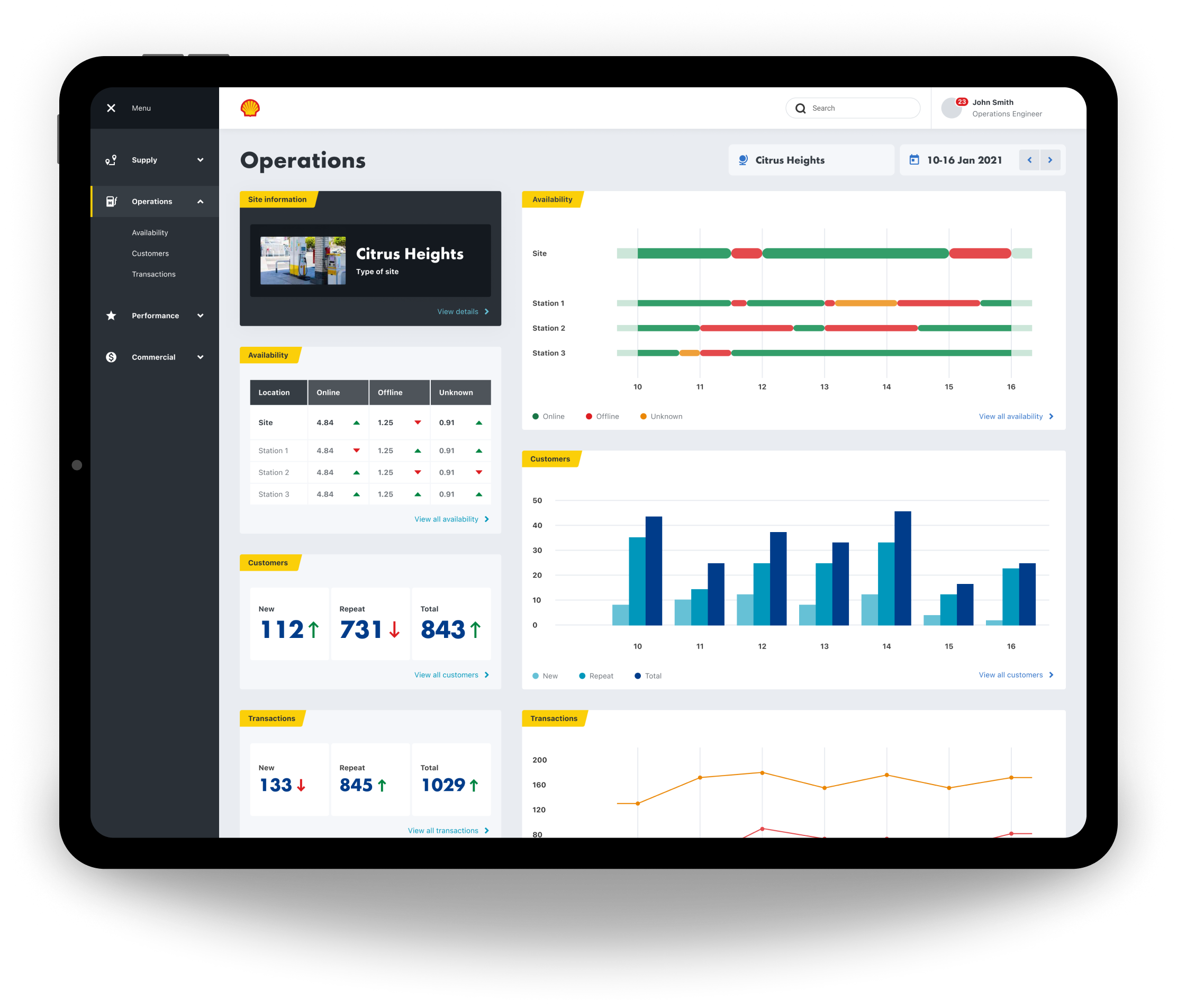
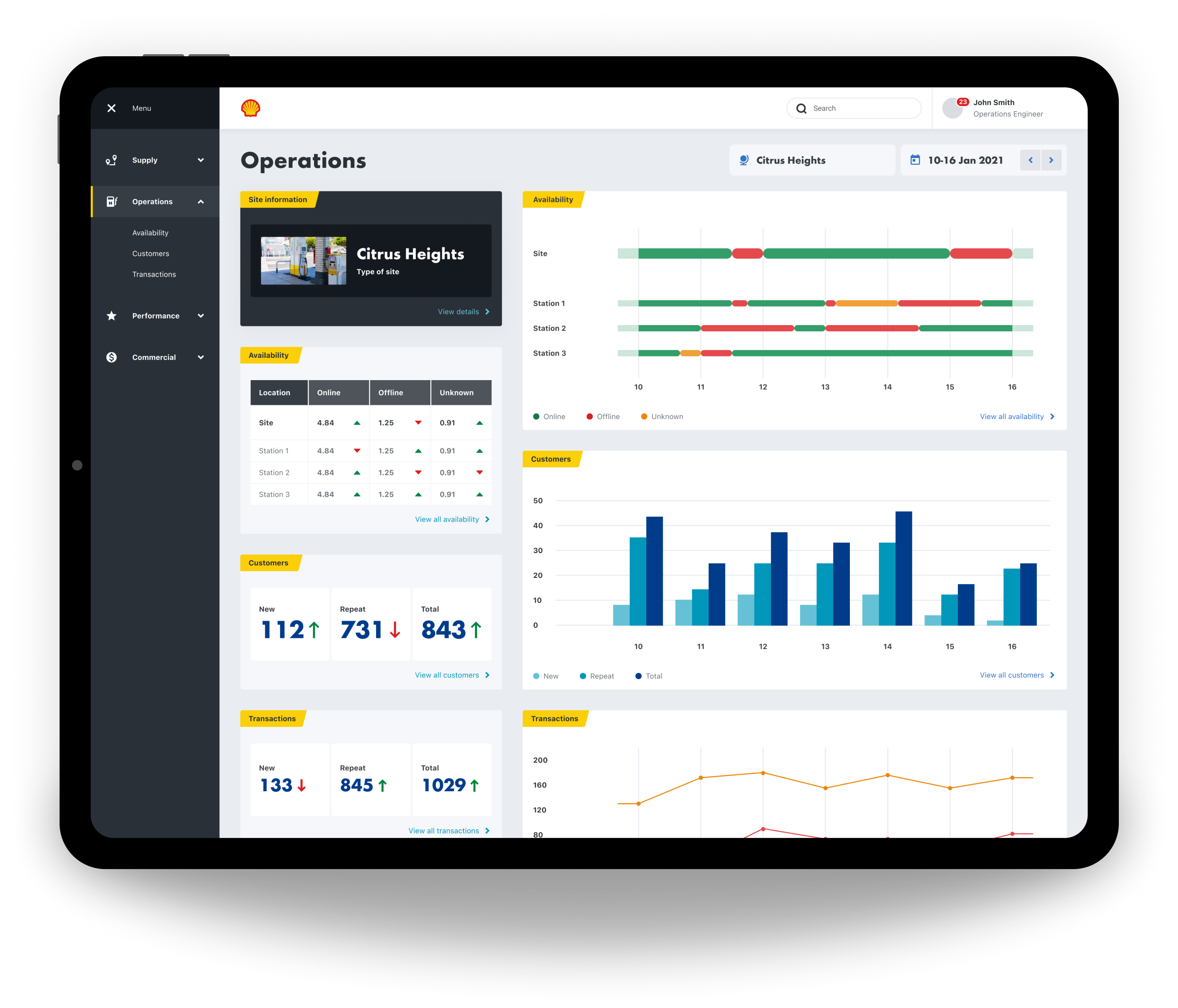
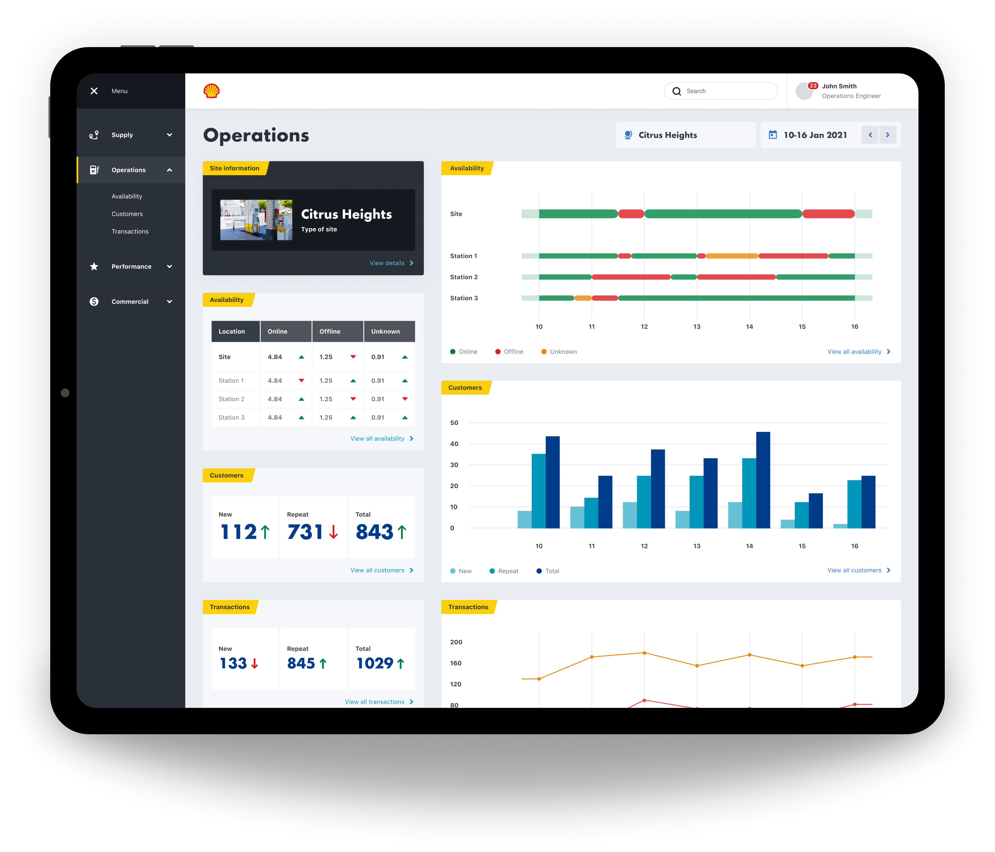
The desktop screens were our next focus, for our users that analyse data predominantly from an office space.
Prototyping
We did as many quick and dirty prototypes as possible, testing them each time via video calls with different Shell employees that work in the hydrogen space, and then uploading each video to Dovetail to be processed.
Outcome
The proof of concept delivered significant value for our users. They were genuinely excited about how the software we were building could simplify their workflows and make their jobs far more efficient.
However, we identified gaps in the data we wanted to expose, as well as inconsistencies in its sources. Some data feeds were not yet fully established, which meant the information wasn’t always accurate or reliable. Because of this, we decided to pivot and focus on securing more complete and trustworthy data sources.
Despite the change in direction, it was a fantastic project to be part of—supporting Shell’s transition toward cleaner energy.
Industry
Energy
Product
Internal tools
Shell
Shell are slowly migrating to cleaner energy. Hydrogen shows huge potential, but there are a number of challenges that need to be overcome first. I was hired by Shell as a Lead Product Designer, to work in a small cross disciplined team, incorporating a Product Owner, UX Researcher, Business Analyst, Front End Engineer, and Back End Engineer. Our task was to get under the surface of the hydrogen process, from extraction to vehicle consumption, and identify all of the different people involved, then surface and visualise all of the different types of data available, so that improvements and efficiencies could be made. This was an internal tools project for Shell.
- Information gathering
- Internal workshop
- Processing our findings
- Personas
- Research
- Planning
- Data
- Structure
- Event types
- Where to focus
- Moodboard
- Mobile design
- Desktop design
- Prototyping
- Outcome


The Process
Information gathering
Our first job was to gather all of the information we could find about Shell’s involvement in hydrogen, and onboard ourselves as quickly as possible.
Internal workshop
We then had an internal workshop where we discussed our learnings, understanding, assumptions, and questions.
Processing our findings
We then processed our workshop findings on to a FigJam board. These findings included what we are doing, who we are doing it for, why we are doing it, what are the jobs to be done, and how we will measure success.
Personas
Next, our UX Researcher put together a few personas that could be shared with our stakeholders.
Research
Early research was then carried out on a number of internal users working in the hydrogen space.
Planning
Next, we started to plan what our different user types might need to do, and why.
We then mapped out provisional steps that might be needed in order to perform each task.
Data
Data was a massive part of this project, so we then began to start listing out every different data type that we could think of within the hydrogen process. We then listed out the different features and functionality that we might need, along with our key variables, such as location and date. After that we started grouping data in to categories, and then in to user types.
Structure
Next we started to think about how all of this might be structured. We came up with four main sections, and the example here is for Operations.
Operations
Event types
As well as different data types, there are also a lot of different event types. We had to identify all of the different event types and create a uniform formula to display them, incorporation the different variables, such as location, date, volume, price, type, and status.
Where to focus
We then needed to focus, so we chose operations to begin with. We identified Operations Directors, Operations Managers, and Operations Engineers as our primary user group. We then identified all of their jobs to be done.
A mood-board was created next, as extra inspiration to go along with the already established Shell Design System.
Navigation & filtering
The navigation followed the needs of our four main user types; Supply, Operations, Performance, and Commercial, with the categories reflectiong their jobs to be done.
Navigation
Location
Date
Mobile screens
Once we had the fundamentals in place we focussed on the mobile screens first, as a large number of our users will be out of the office and travelling between hydrogen sites, so quick and easy access is needed to the available data.
Log in
Homepage
Operations
Site info
Desktop screens
The desktop screens were our next focus, for our users that analyse data predominantly from an office space.
Prototyping
We did as many quick and dirty prototypes as possible, testing them each time via video calls with different Shell employees that work in the hydrogen space, and then uploading each video to Dovetail to be processed.
Outcome
The proof of concept delivered significant value for our users. They were genuinely excited about how the software we were building could simplify their workflows and make their jobs far more efficient.
However, we identified gaps in the data we wanted to expose, as well as inconsistencies in its sources. Some data feeds were not yet fully established, which meant the information wasn’t always accurate or reliable. Because of this, we decided to pivot and focus on securing more complete and trustworthy data sources.
Despite the change in direction, it was a fantastic project to be part of—supporting Shell’s transition toward cleaner energy.

Industry
Energy
Product
Internal tools
Shell
Shell are slowly migrating to cleaner energy. Hydrogen shows huge potential, but there are a number of challenges that need to be overcome first. I was hired by Shell as a Lead Product Designer, to work in a small cross disciplined team, incorporating a Product Owner, UX Researcher, Business Analyst, Front End Engineer, and Back End Engineer. Our task was to get under the surface of the hydrogen process, from extraction to vehicle consumption, and identify all of the different people involved, then surface and visualise all of the different types of data available, so that improvements and efficiencies could be made. This was an internal tools project for Shell.
- Information gathering
- Internal workshop
- Processing our findings
- Personas
- Research
- Planning
- Data
- Structure
- Event types
- Where to focus
- Moodboard
- Mobile design
- Desktop design
- Prototyping
- Outcome
The Process
Information gathering
Our first job was to gather all of the information we could find about Shell’s involvement in hydrogen, and onboard ourselves as quickly as possible.
Internal workshop
We then had an internal workshop where we discussed our learnings, understanding, assumptions, and questions.
Processing our findings
We then processed our workshop findings on to a FigJam board. These findings included what we are doing, who we are doing it for, why we are doing it, what are the jobs to be done, and how we will measure success.
Personas
Next, our UX Researcher put together a few personas that could be shared with our stakeholders.
Research
Early research was then carried out on a number of internal users working in the hydrogen space.
Planning
Next, we started to plan what our different user types might need to do, and why.
We then mapped out provisional steps that might be needed in order to perform each task.
Data
Data was a massive part of this project, so we then began to start listing out every different data type that we could think of within the hydrogen process. We then listed out the different features and functionality that we might need, along with our key variables, such as location and date. After that we started grouping data in to categories, and then in to user types.
Structure
Next we started to think about how all of this might be structured. We came up with four main sections, and the example here is for Operations.
Operations
Event types
As well as different data types, there are also a lot of different event types. We had to identify all of the different event types and create a uniform formula to display them, incorporation the different variables, such as location, date, volume, price, type, and status.
Where to focus
We then needed to focus, so we chose operations to begin with. We identified Operations Directors, Operations Managers, and Operations Engineers as our primary user group. We then identified all of their jobs to be done.
A mood-board was created next, as extra inspiration to go along with the already established Shell Design System.
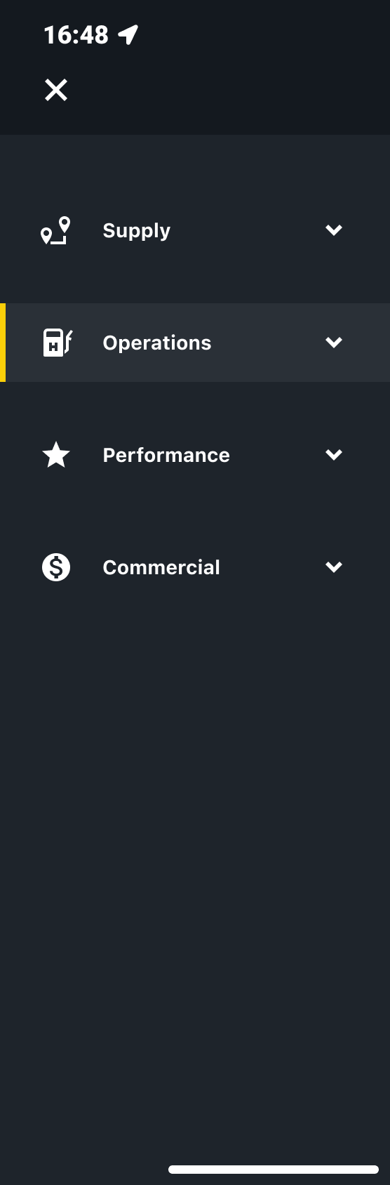
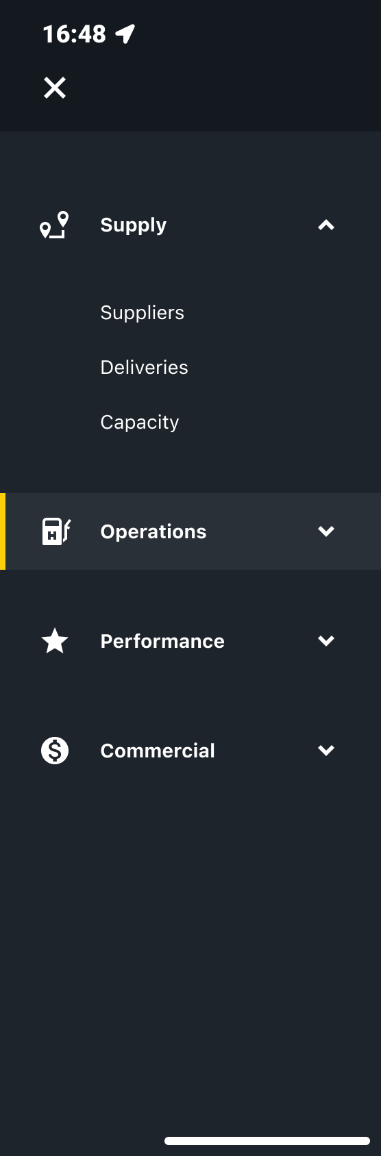
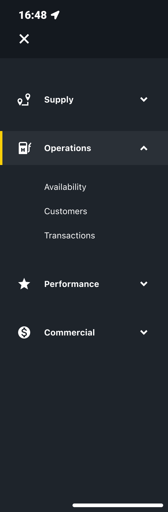
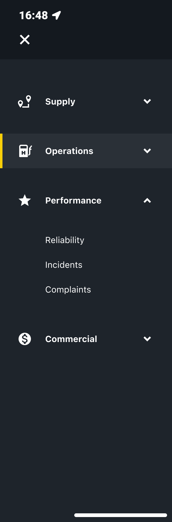
Navigation & filtering
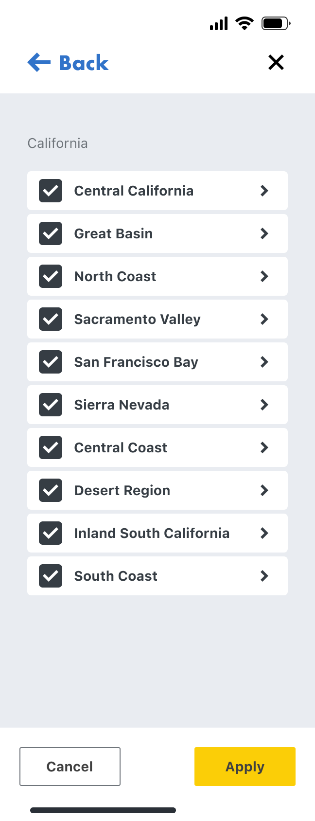
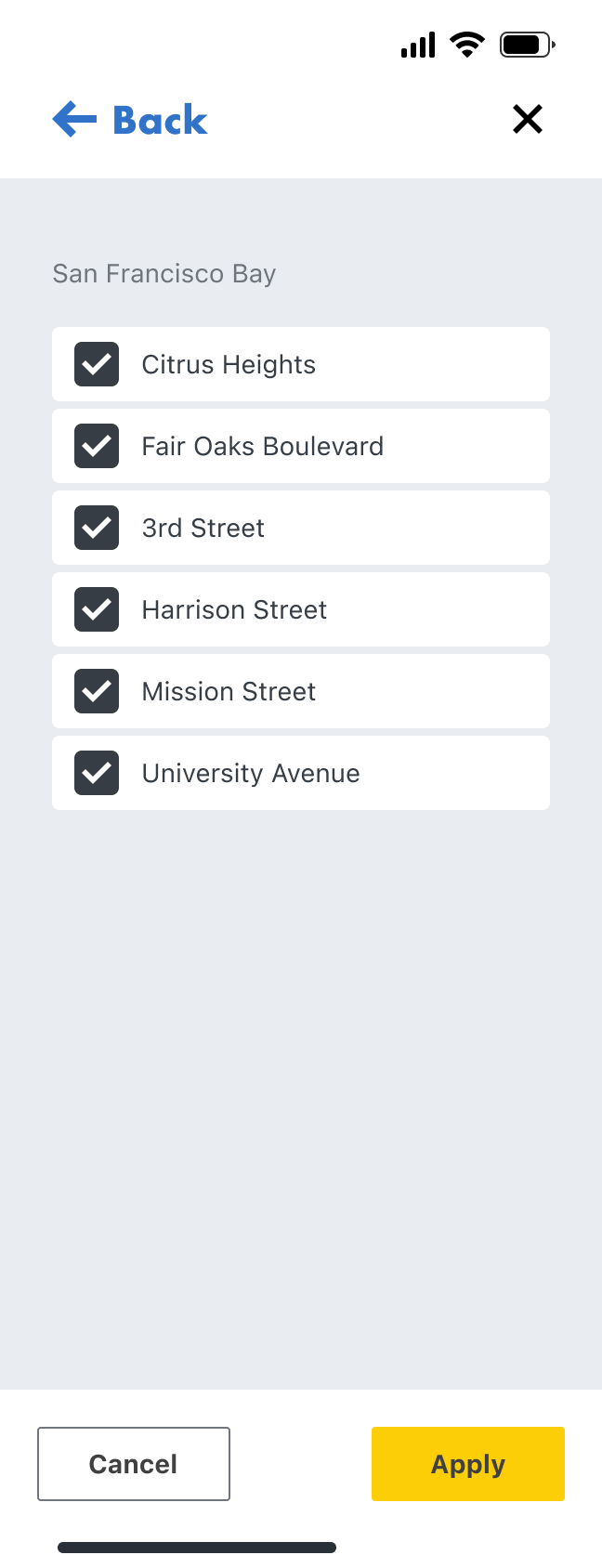
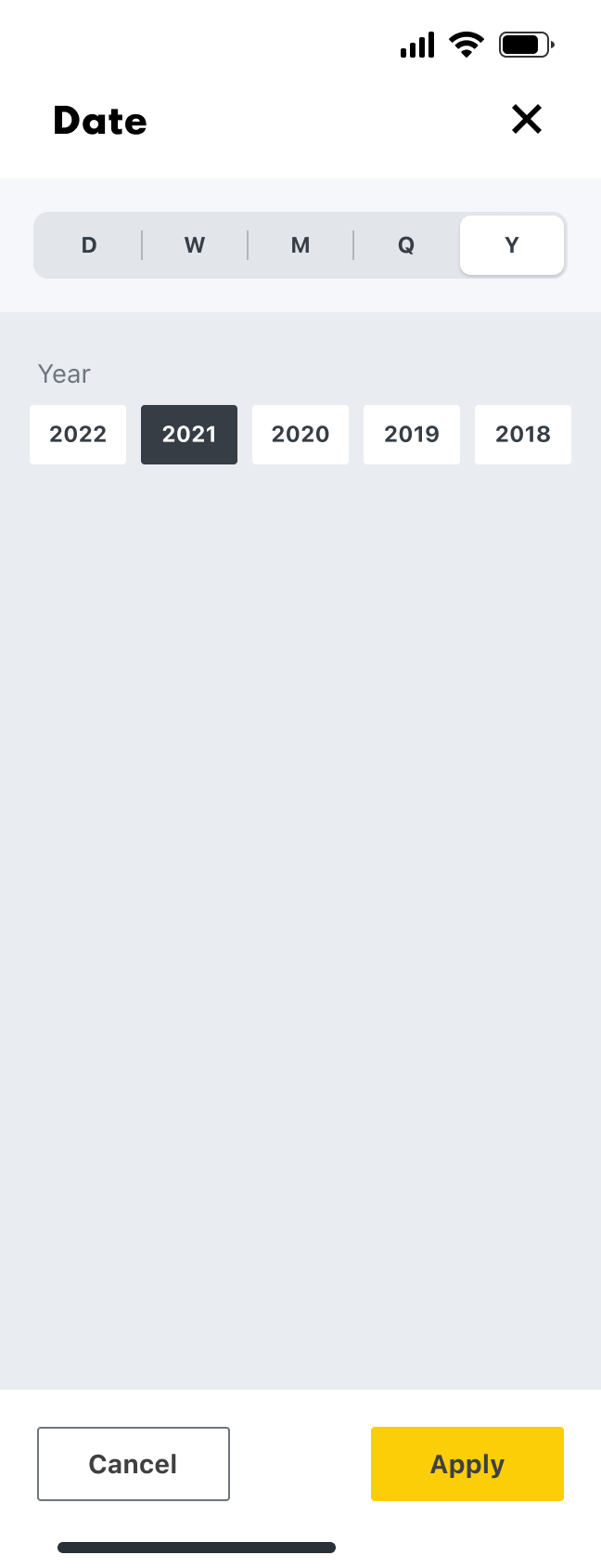
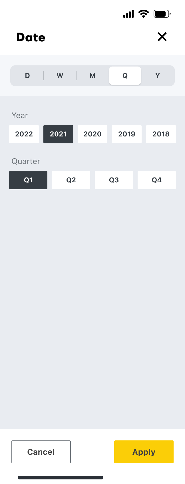
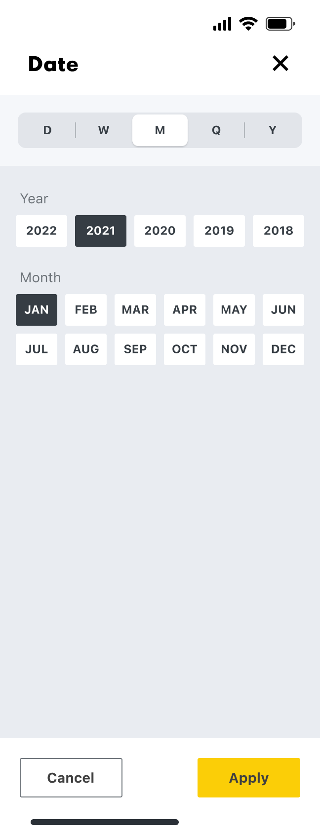
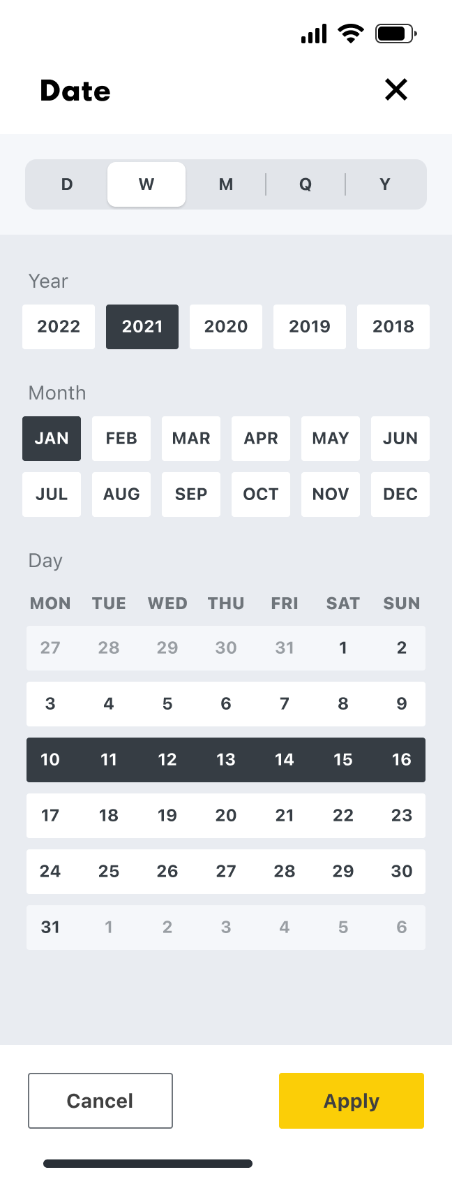
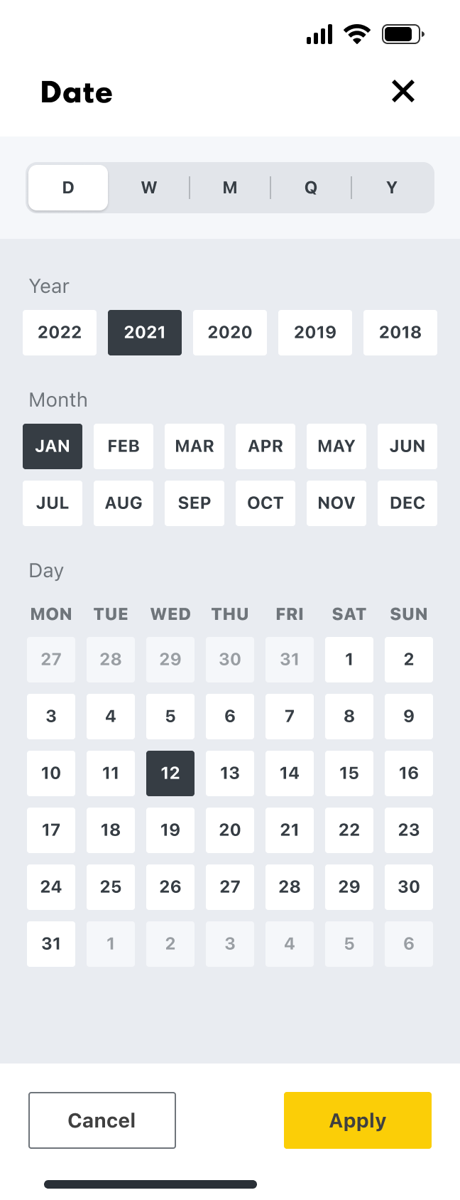
The navigation followed the needs of our four main user types; Supply, Operations, Performance, and Commercial, with the sub-categories reflecting their jobs to be done. Within this, the user can then drill down further by location and date.
Navigation
Location
Date
Mobile screens
Once we had the fundamentals in place we focussed on the mobile screens first, as a large number of our users will be out of the office and travelling between hydrogen sites, so quick and easy access is needed to the available data.
Log in
Homepage
Operations
Site info
Desktop screens
The desktop screens were our next focus, for our users that analyse data predominantly from an office space.
Prototyping
We did as many quick and dirty prototypes as possible, testing them each time via video calls with different Shell employees that work in the hydrogen space, and then uploading each video to Dovetail to be processed.
Outcome
The proof of concept delivered significant value for our users. They were genuinely excited about how the software we were building could simplify their workflows and make their jobs far more efficient.
However, we identified gaps in the data we wanted to expose, as well as inconsistencies in its sources. Some data feeds were not yet fully established, which meant the information wasn’t always accurate or reliable. Because of this, we decided to pivot and focus on securing more complete and trustworthy data sources.
Despite the change in direction, it was a fantastic project to be part of—supporting Shell’s transition toward cleaner energy.

Industry
Energy
Product
Internal tools
Shell
Shell are slowly migrating to cleaner energy. Hydrogen shows huge potential, but there are a number of challenges that need to be overcome first. I was hired by Shell as a Lead Product Designer, to work in a small cross disciplined team, incorporating a Product Owner, UX Researcher, Business Analyst, Front End Engineer, and Back End Engineer. Our task was to get under the surface of the hydrogen process, from extraction to vehicle consumption, and identify all of the different people involved, then surface and visualise all of the different types of data available, so that improvements and efficiencies could be made. This was an internal tools project for Shell.
- Information gathering
- Internal workshop
- Processing our findings
- Personas
- Research
- Planning
- Data
- Structure
- Event types
- Where to focus
- Moodboard
- Mobile design
- Desktop design
- Prototyping
- Outcome
The Process
Information gathering
Our first job was to gather all of the information we could find about Shell’s involvement in hydrogen, and onboard ourselves as quickly as possible.
Internal workshop
We then had an internal workshop where we discussed our learnings, understanding, assumptions, and questions.
Processing our findings
We then processed our workshop findings on to a FigJam board. These findings included what we are doing, who we are doing it for, why we are doing it, what are the jobs to be done, and how we will measure success.
Personas
Next, our UX Researcher put together a few personas that could be shared with our stakeholders.
Research
Early research was then carried out on a number of internal users working in the hydrogen space.
Planning
Next, we started to plan what our different user types might need to do, and why.
We then mapped out provisional steps that might be needed in order to perform each task.
Data
Data was a massive part of this project, so we then began to start listing out every different data type that we could think of within the hydrogen process. We then listed out the different features and functionality that we might need, along with our key variables, such as location and date. After that we started grouping data in to categories, and then in to user types.
Structure
Next we started to think about how all of this might be structured. We came up with four main sections, and the example here is for Operations.
Operations
Event types
As well as different data types, there are also a lot of different event types. We had to identify all of the different event types and create a uniform formula to display them, incorporation the different variables, such as location, date, volume, price, type, and status.
Where to focus
We then needed to focus, so we chose operations to begin with. We identified Operations Directors, Operations Managers, and Operations Engineers as our primary user group. We then identified all of their jobs to be done.
A mood-board was created next, as extra inspiration to go along with the already established Shell Design System.
Navigation & filtering
The navigation followed the needs of our four main user types; Supply, Operations, Performance, and Commercial, with the categories reflectiong their jobs to be done.
Navigation
Location
Date
Mobile screens
Once we had the fundamentals in place we focussed on the mobile screens first, as a large number of our users will be out of the office and travelling between hydrogen sites, so quick and easy access is needed to the available data.
Log in
Homepage
Operations
Site info
Desktop screens
The desktop screens were our next focus, for our users that analyse data predominantly from an office space.
Prototyping
We did as many quick and dirty prototypes as possible, testing them each time via video calls with different Shell employees that work in the hydrogen space, and then uploading each video to Dovetail to be processed.
Outcome
The proof of concept delivered significant value for our users. They were genuinely excited about how the software we were building could simplify their workflows and make their jobs far more efficient.
However, we identified gaps in the data we wanted to expose, as well as inconsistencies in its sources. Some data feeds were not yet fully established, which meant the information wasn’t always accurate or reliable. Because of this, we decided to pivot and focus on securing more complete and trustworthy data sources.
Despite the change in direction, it was a fantastic project to be part of—supporting Shell’s transition toward cleaner energy.