
Industry
Retail
Product
Website
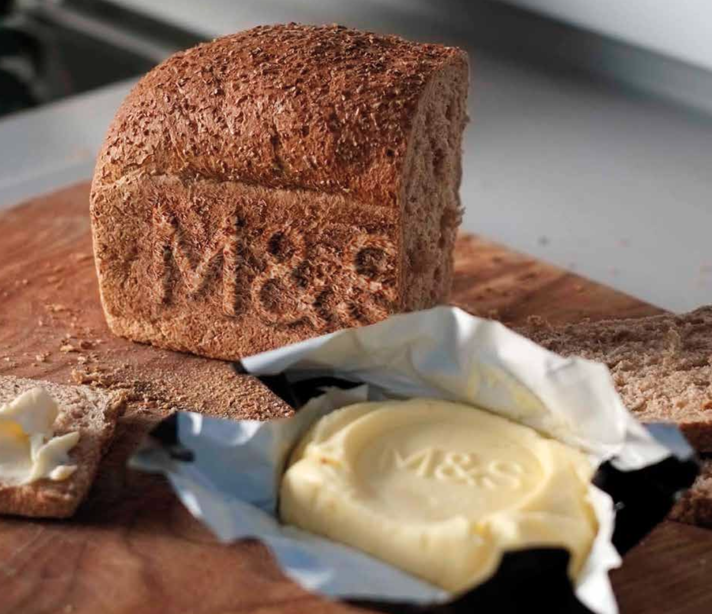
M&S


Marks & Spencer used to have a mobile site, a tablet site, a desktop site, and an in-store touch screen site. Each site had a different navigation, design, and user experience. I was tasked with reviewing all of the existing design and UX across all devices, then putting forward a new fully responsive proposal, incorporating a new brand guideline.


The brief
The brief was to take one complete user journey and find a consistent UX and design approach that worked across all screen sizes and devices, from 360 mobile up to 1920 in store touch screen.
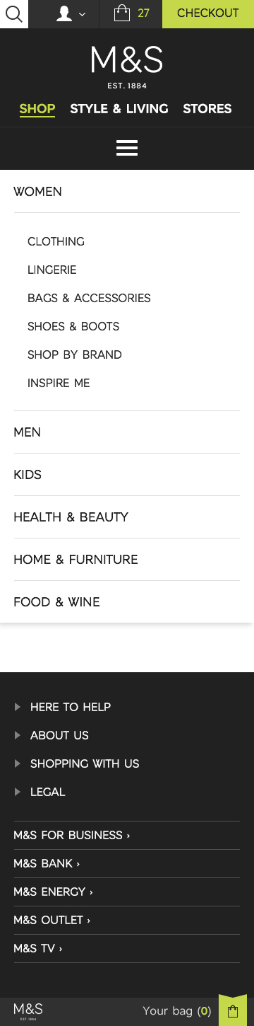
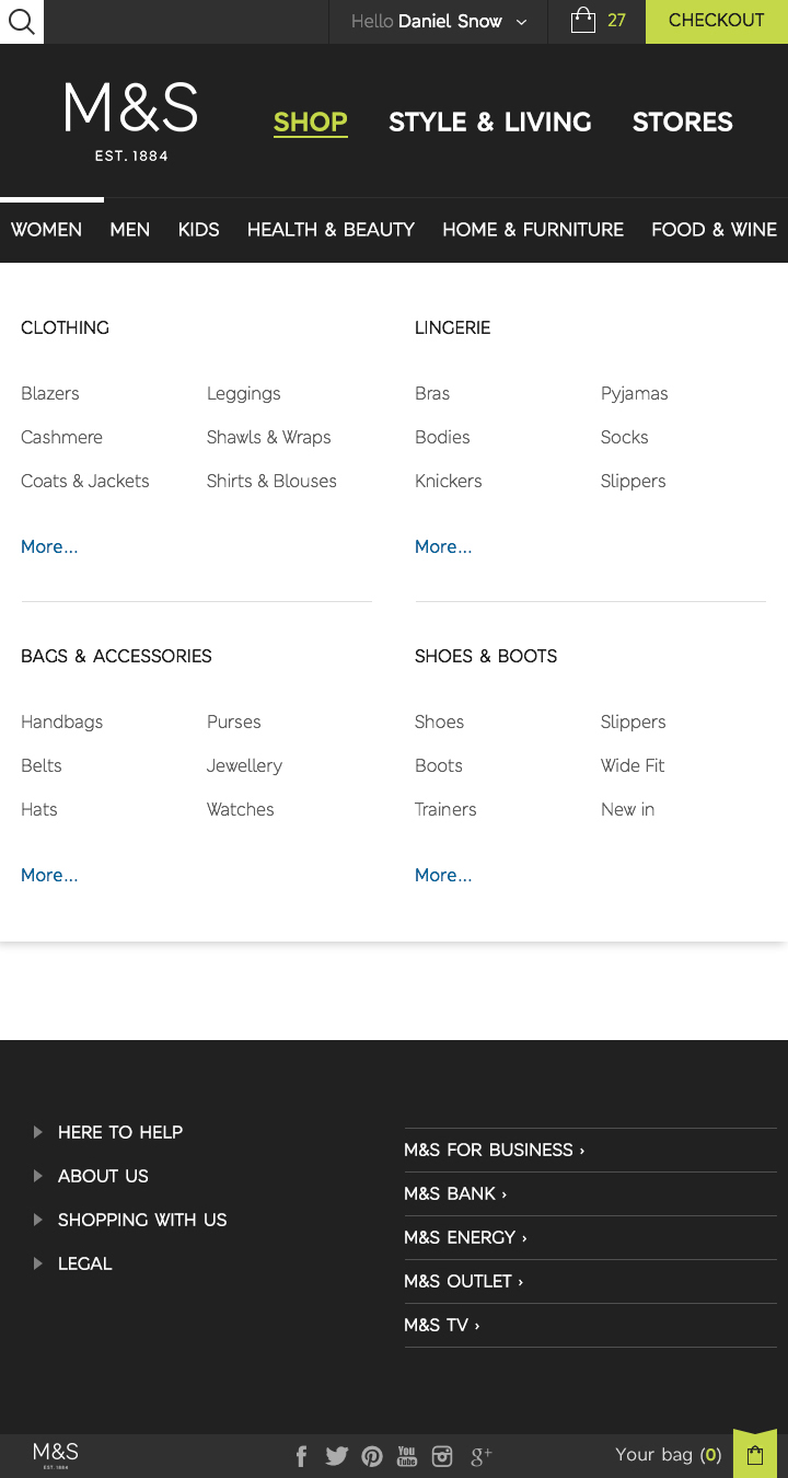
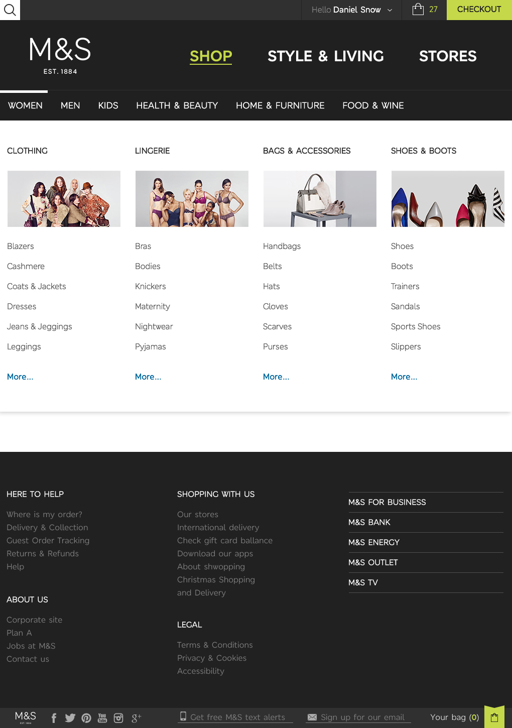
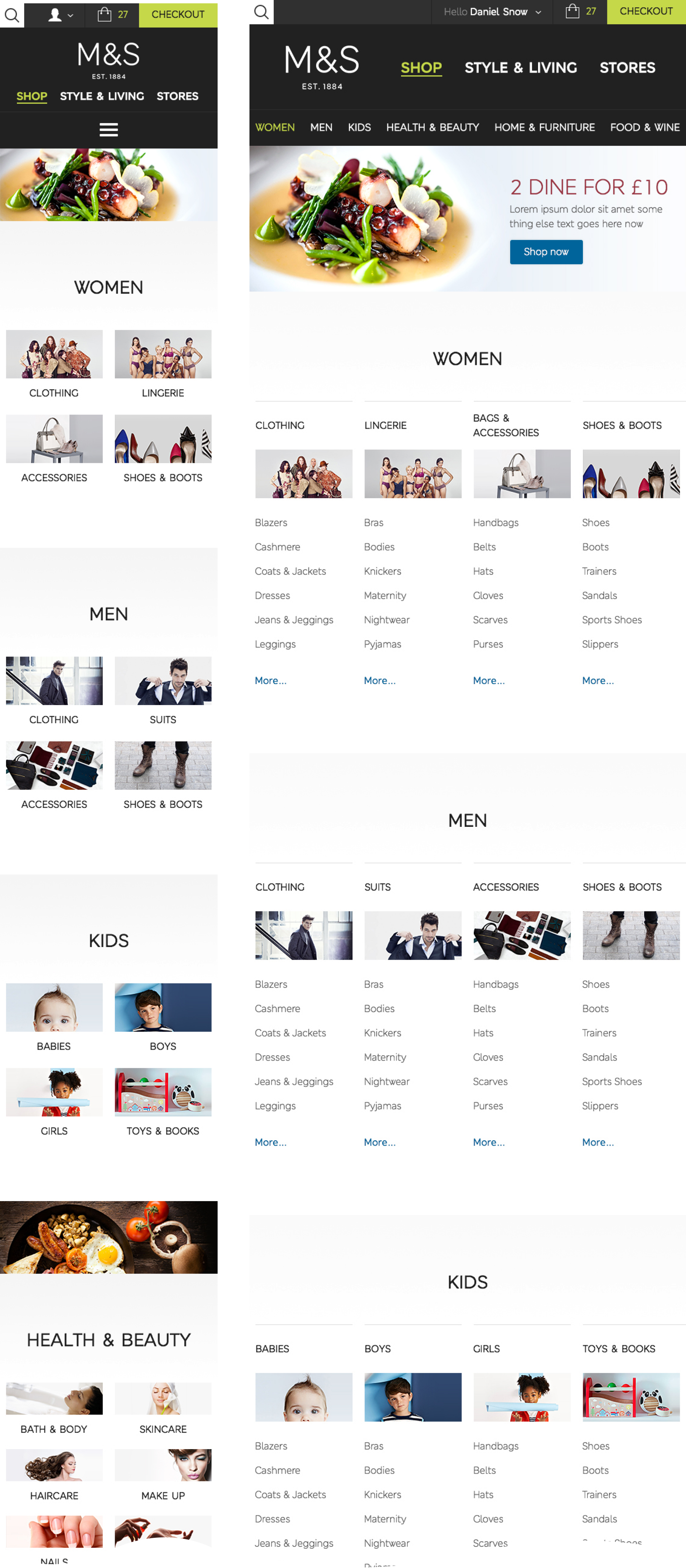
Navigation
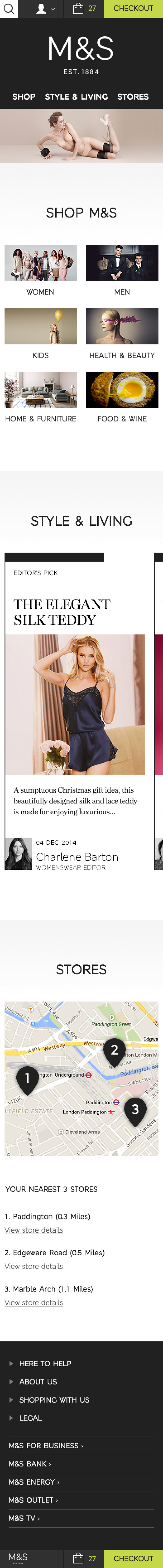
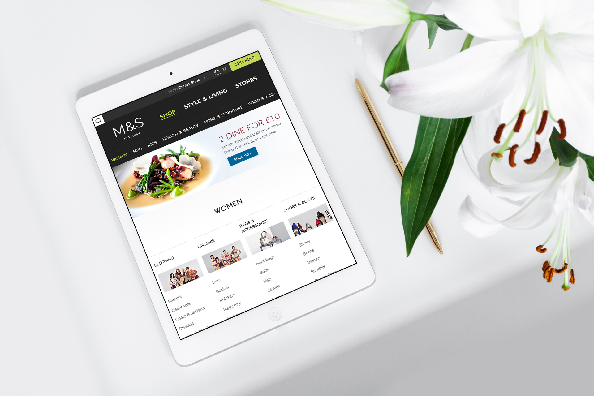
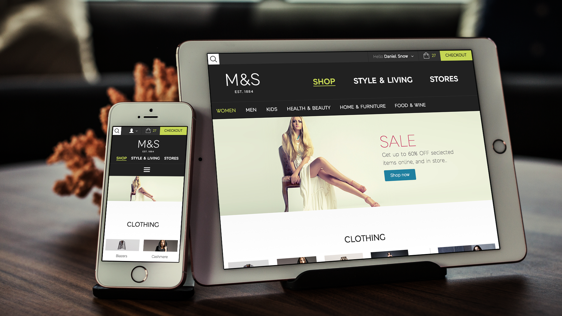
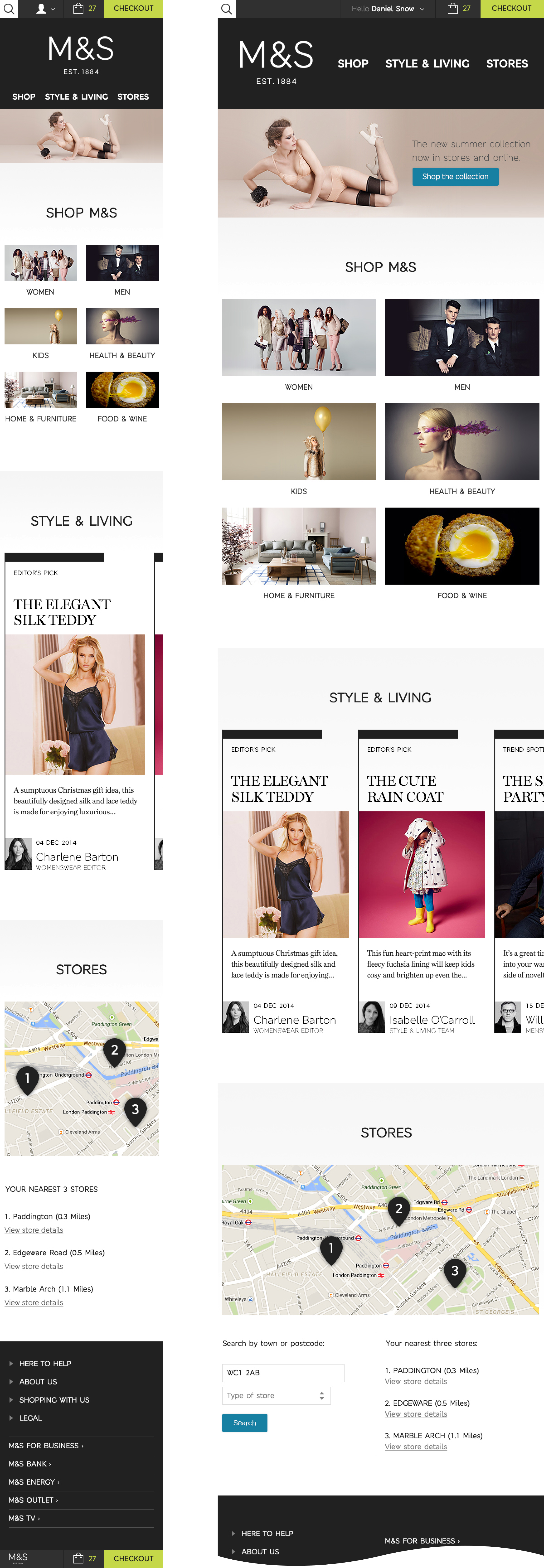
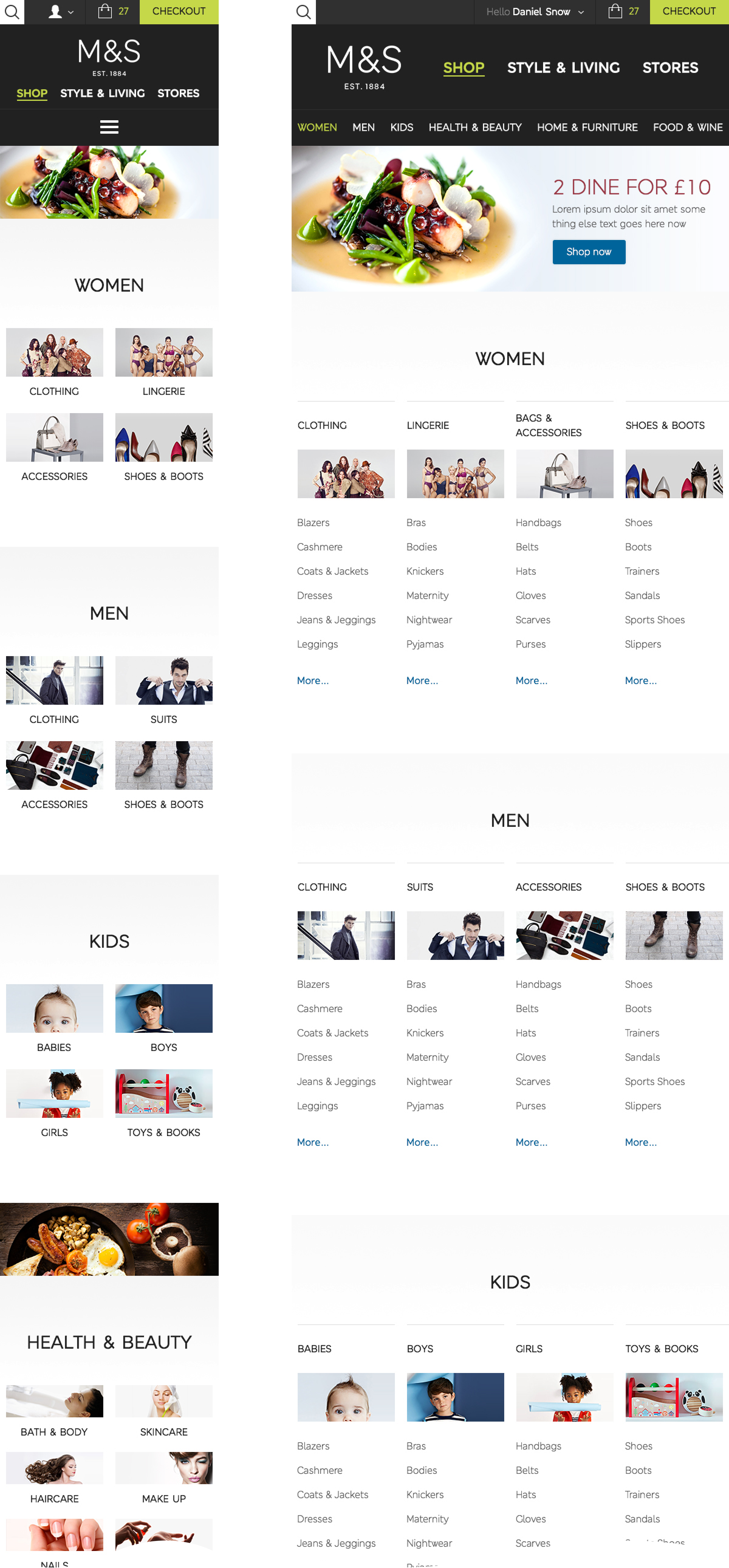
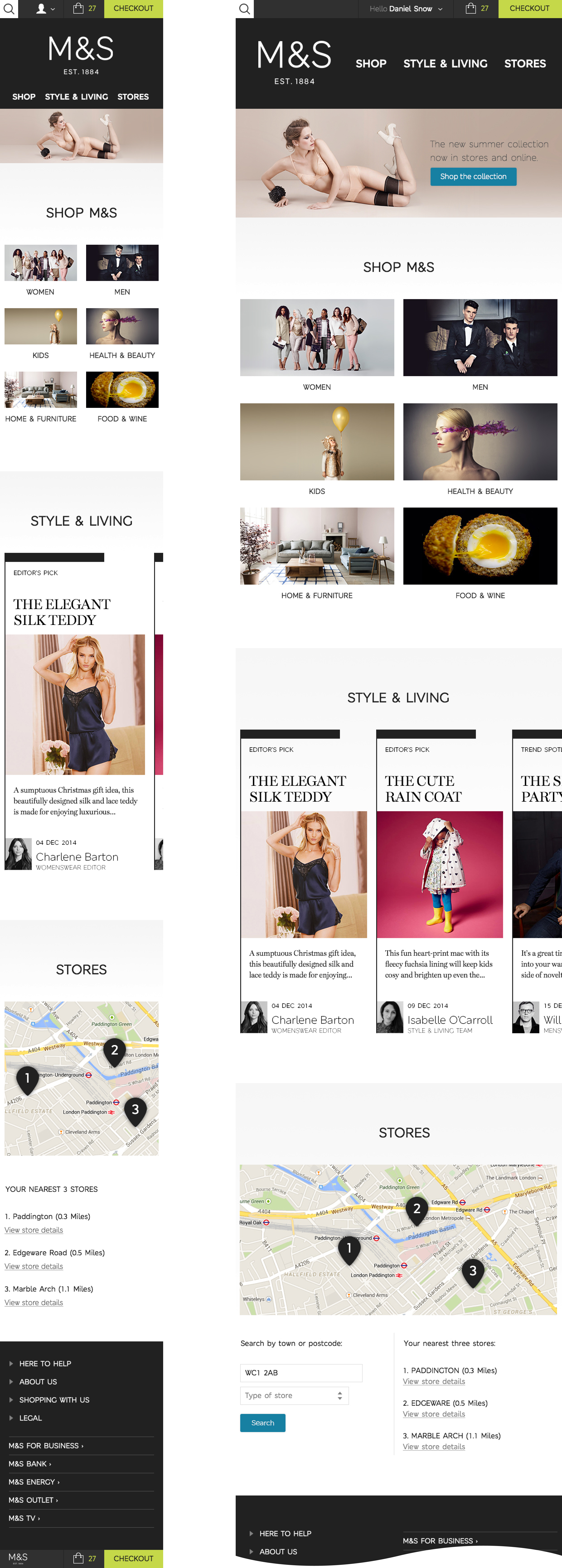
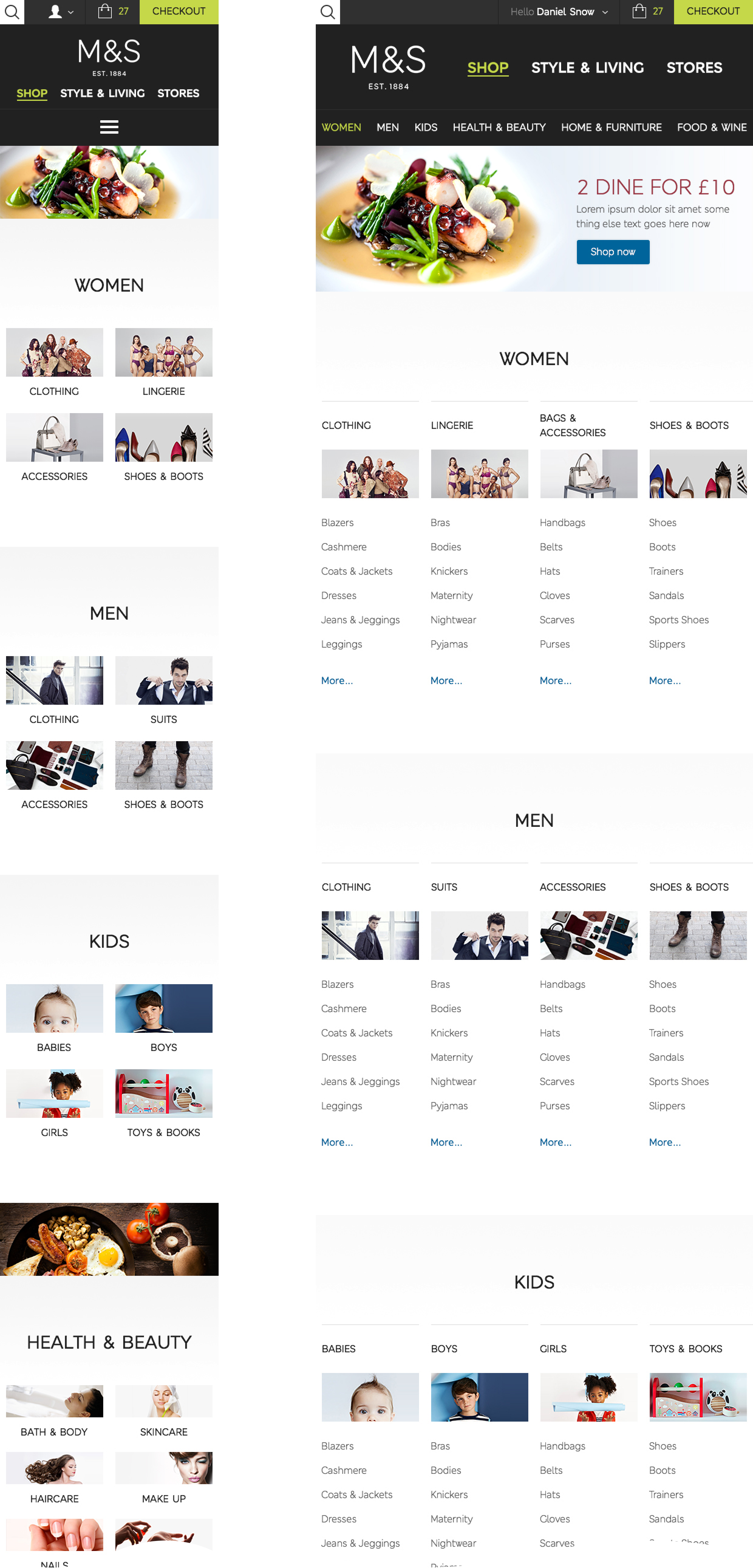
The primary navigation has three sections; Shop, Style & Living, and Stores. As there are only three sections they don’t need to be hidden behind a burger menu, they can be viewable at all times.
Under the shop section, there are a further six sub navigation areas; Women, Men, Kids, Health & Beauty, Home & Furniture, and Food & Wine. These six sub navigation links are fully viewable from tablet portrait, so do not need to be hidden behind a burger menu, or scrolled. All other content is linked to on-page.
The header, navigation and sub navigation are consistent across all screen sizes. The sub navigation only needs to be hidden behind a burger menu on a mobile phone screen.
Search, Account, Shopping Bag, and Checkout are all in the same location, the same size, and function the same across all screen sizes.
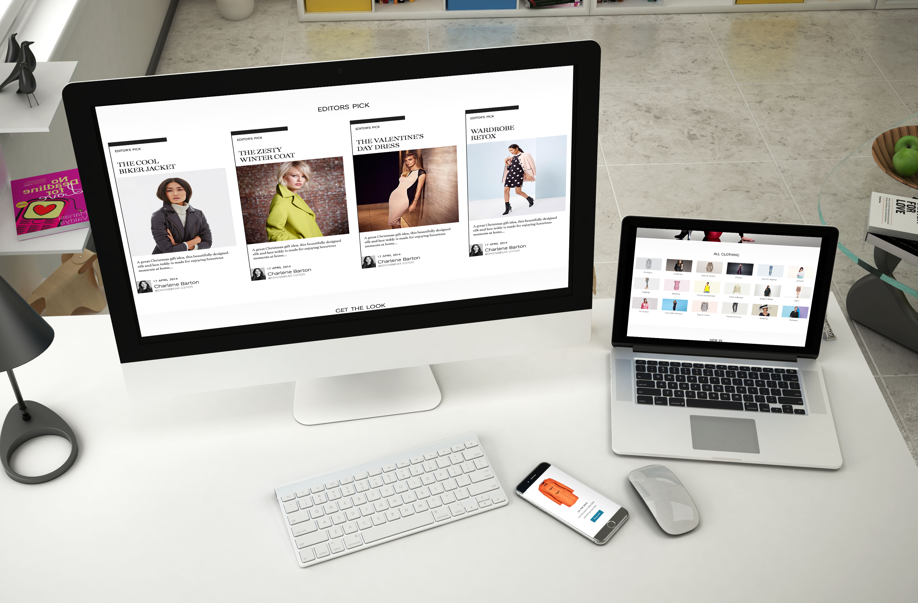
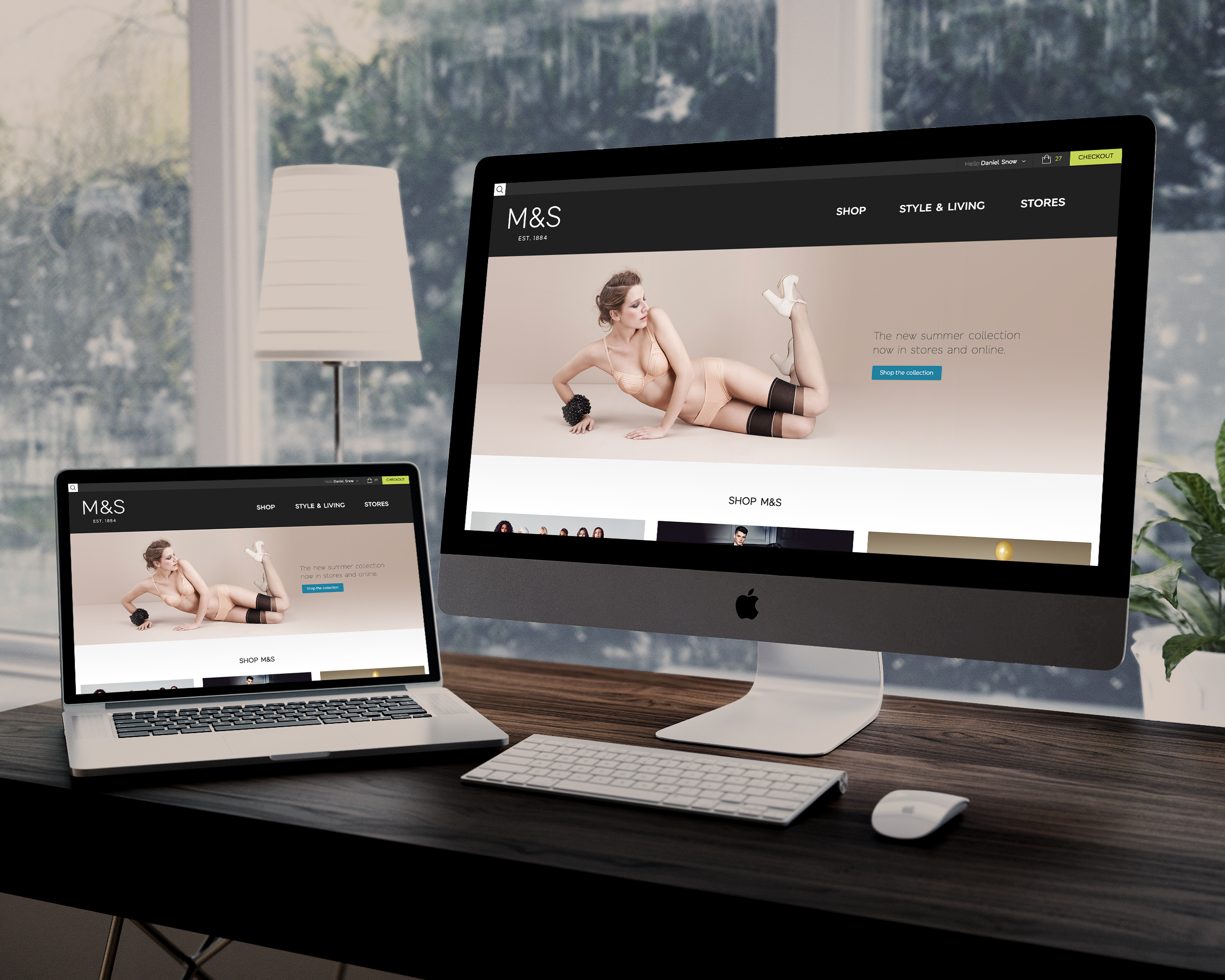
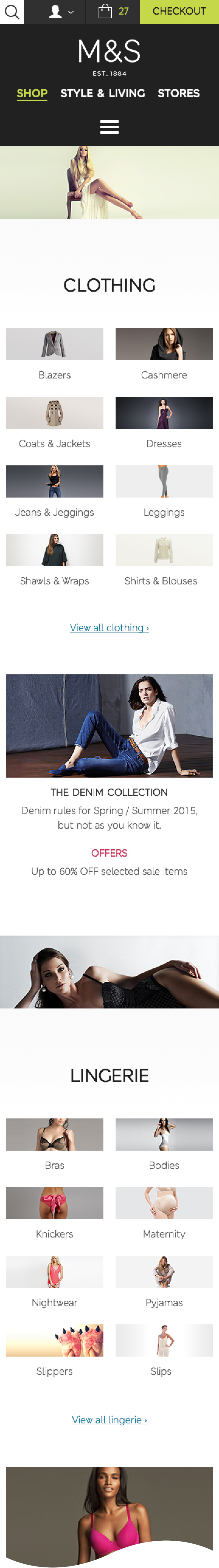
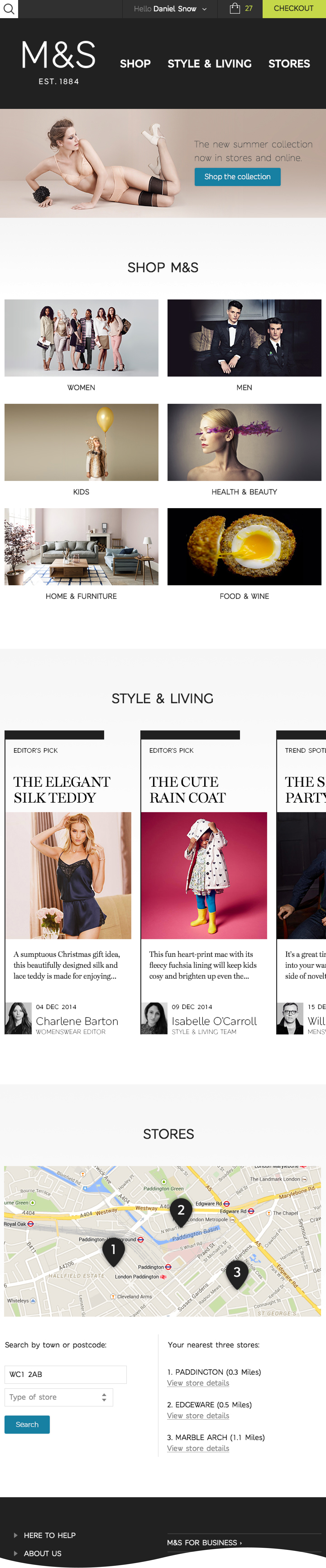
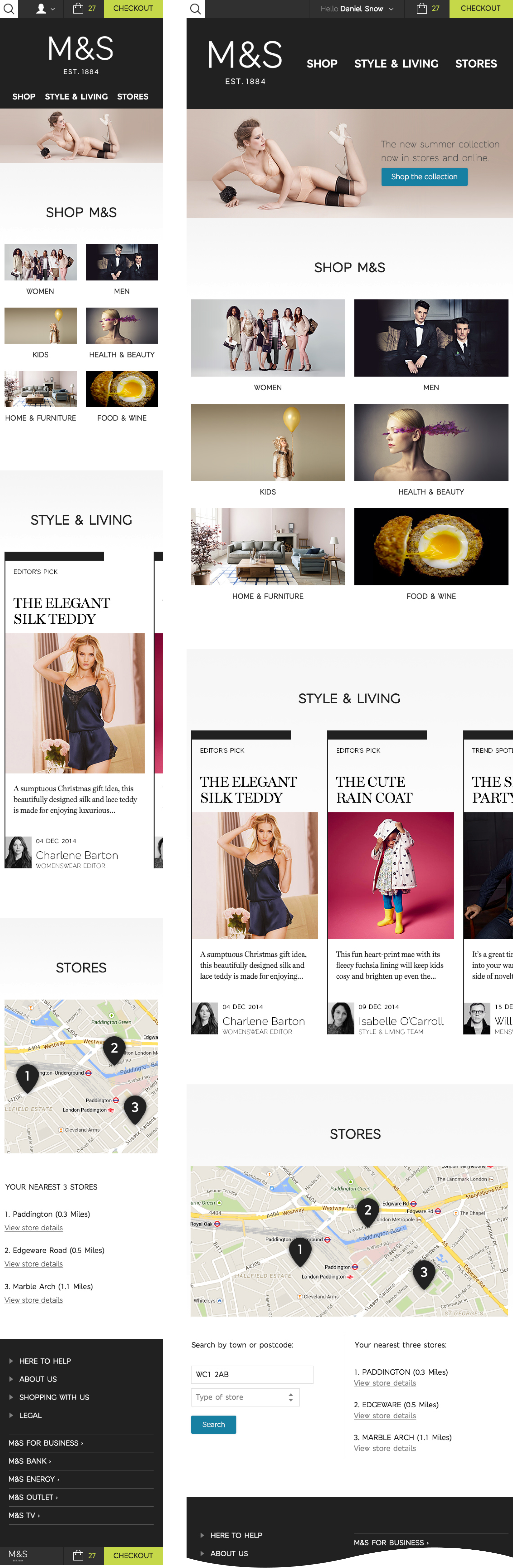
Homepage
The homepage now consists of only four parts. The feature area, shop, style & living, and stores. They are separated in to clear, easy to digest vertical chunks of information. The user scrolls from one part to the next. The feature area will tie in with current marketing material. The user can click straight through to the main shop categories, therefore skipping a page in the user journey. They can browse the latest Style & Living editorial, or find a Store. A logged in user that has bought from M&S before can now go from home to checkout in only five clicks.
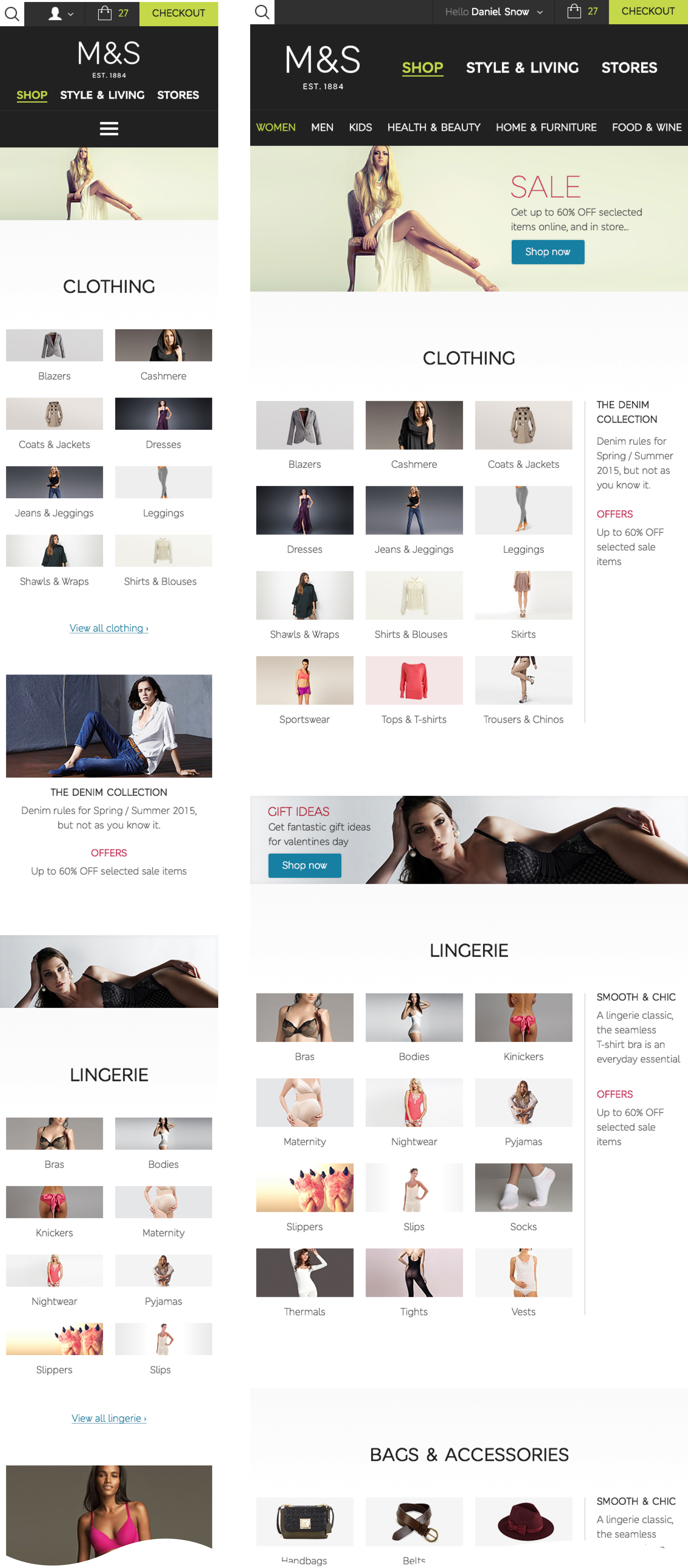
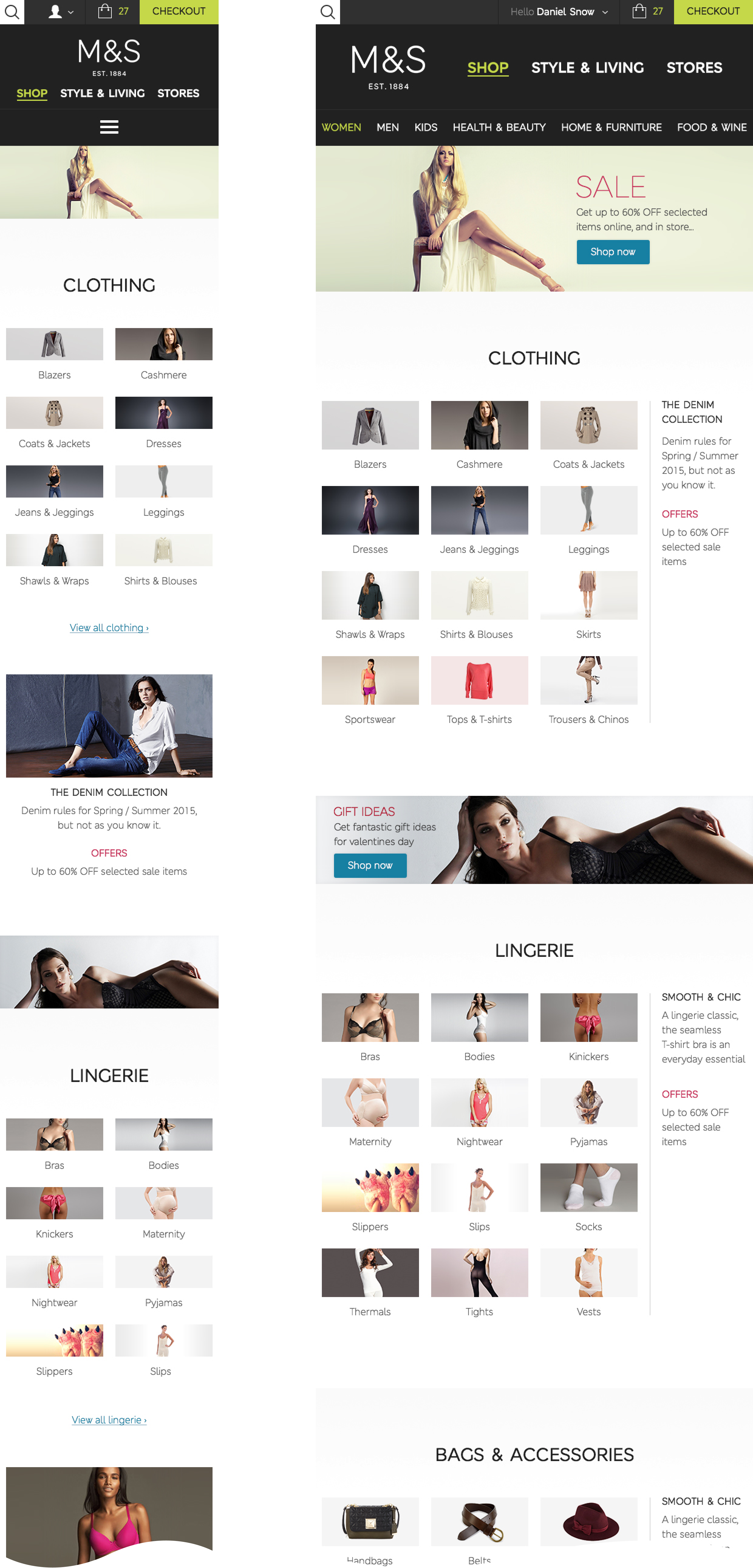
Shop
The shop section is product focused, allowing users to find what they are looking for quickly and easily, with minimal distraction.
The landing page will act as a directory / site map of the shop area, but it can be skipped if a user clicks on a main shop category
on the homepage. From here a user can skip the next two pages of the sitemap, and jump straight to a product listing page.
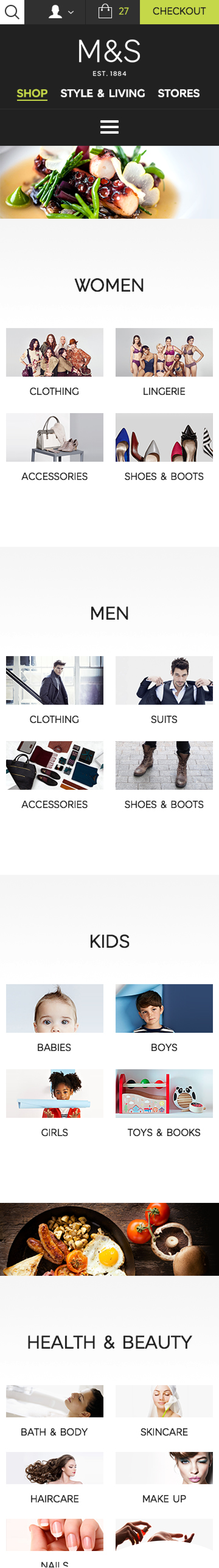
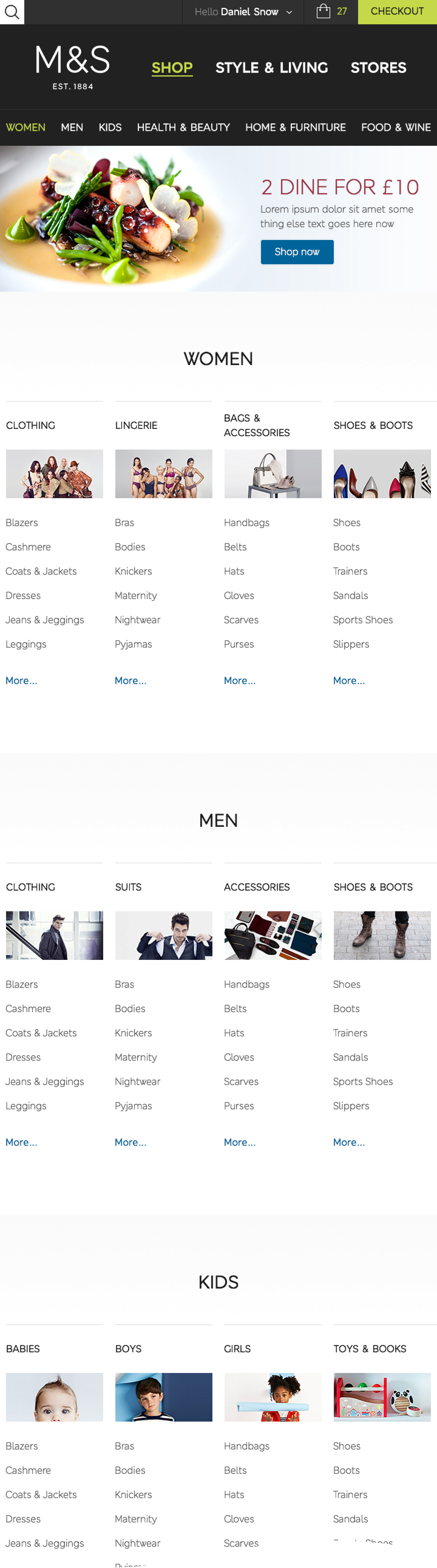
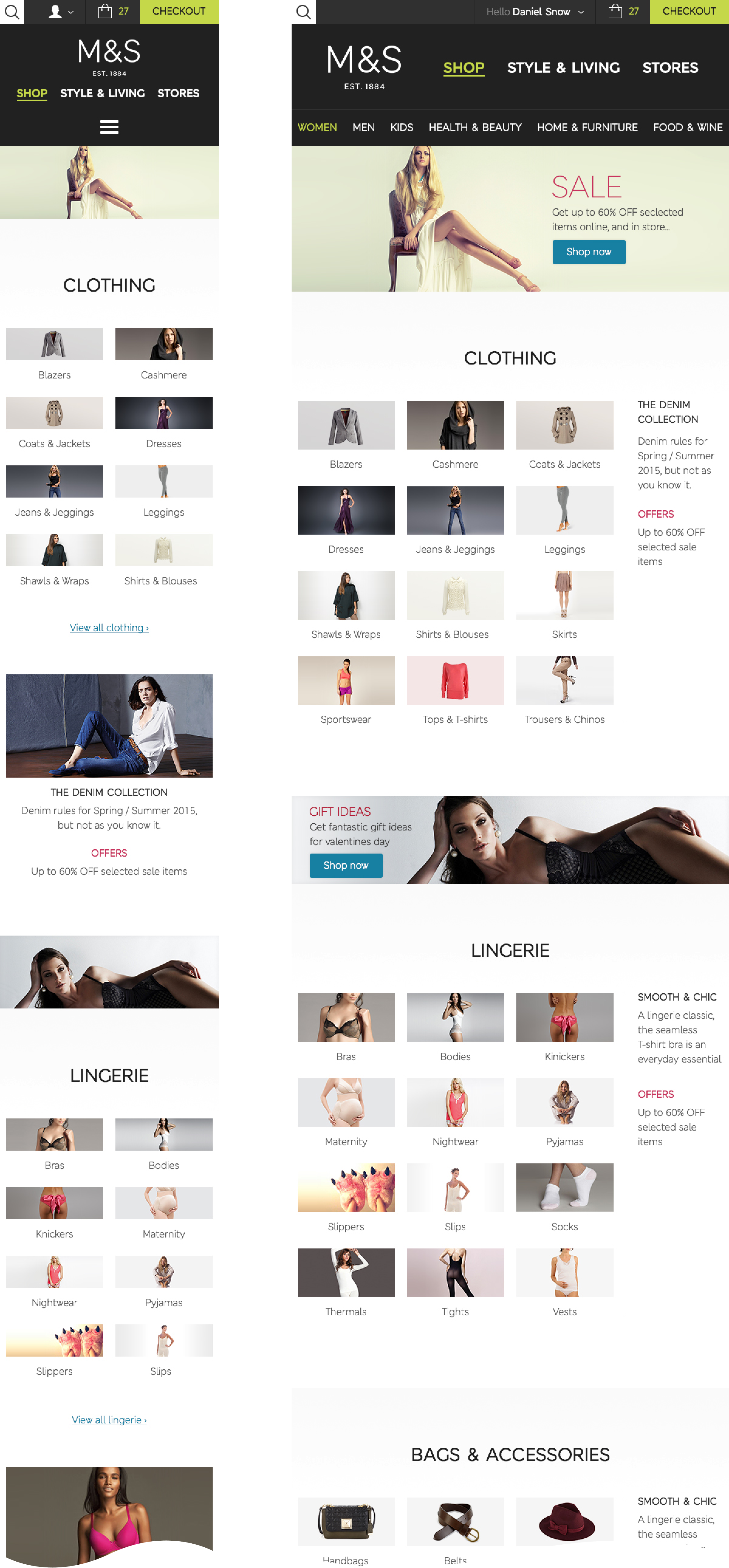
Women
There are four keys areas, plus shop by brand, and be inspired. Each area lists the main product categories. From here a user can jump straight to a product listing page and skip the next page in the site map. This page has space for two promo messages within each key area, and three separate promo areas.
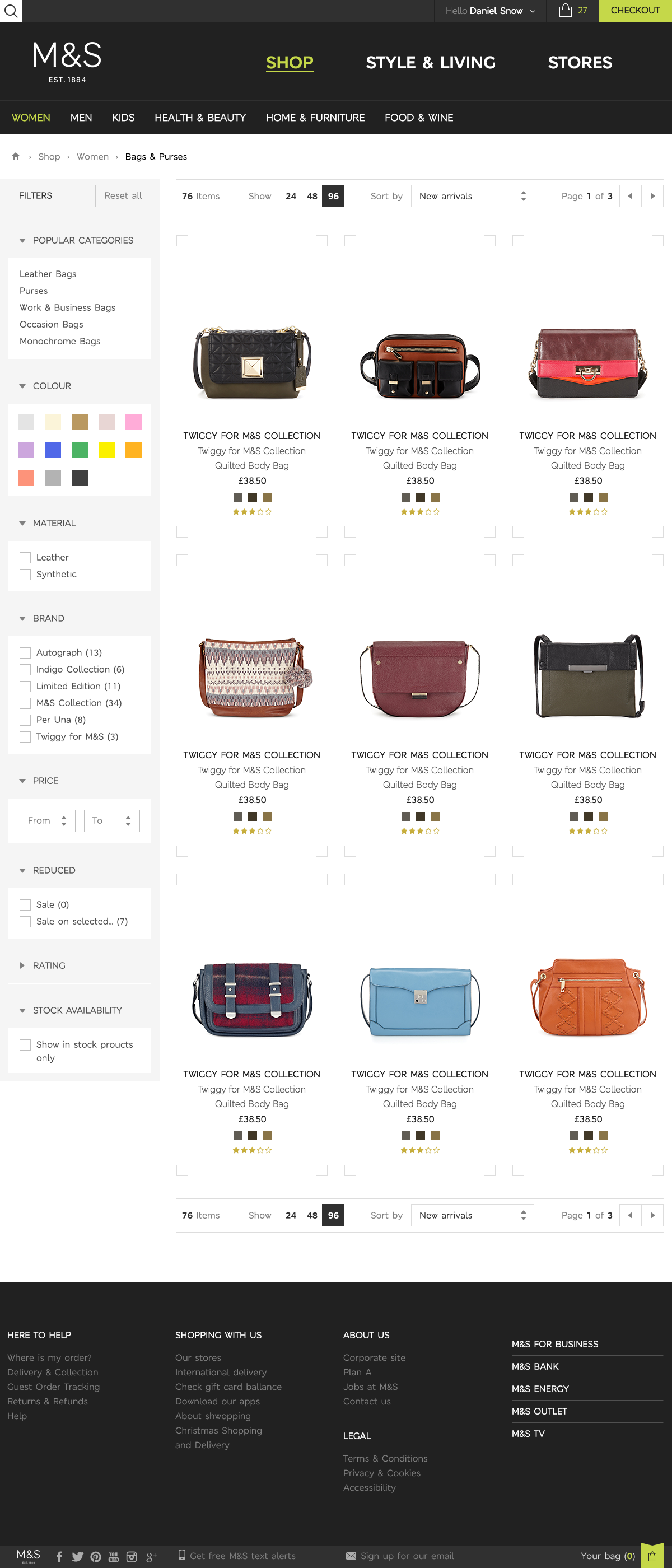
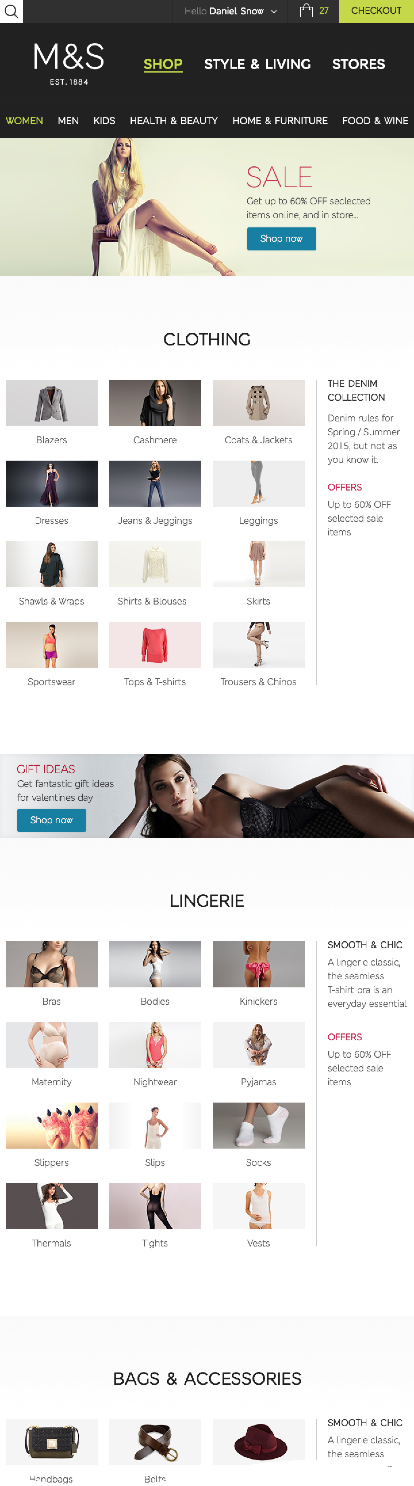
Product listing
The product listing page keeps all of the current content on the site at the minute. The filters are collapsed on screen sizes lower than 960.
The page has one column up to 600, two columns up to 960, three columns up to 1200, four columns up to 1860, and six columns above that.
Each product item area has a set of rules, a minimum and maximum size before reaching a breakpoint.
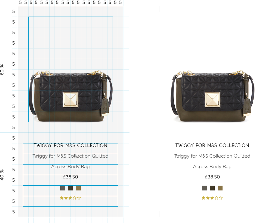
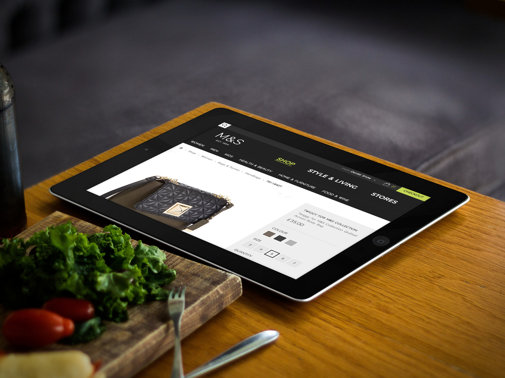
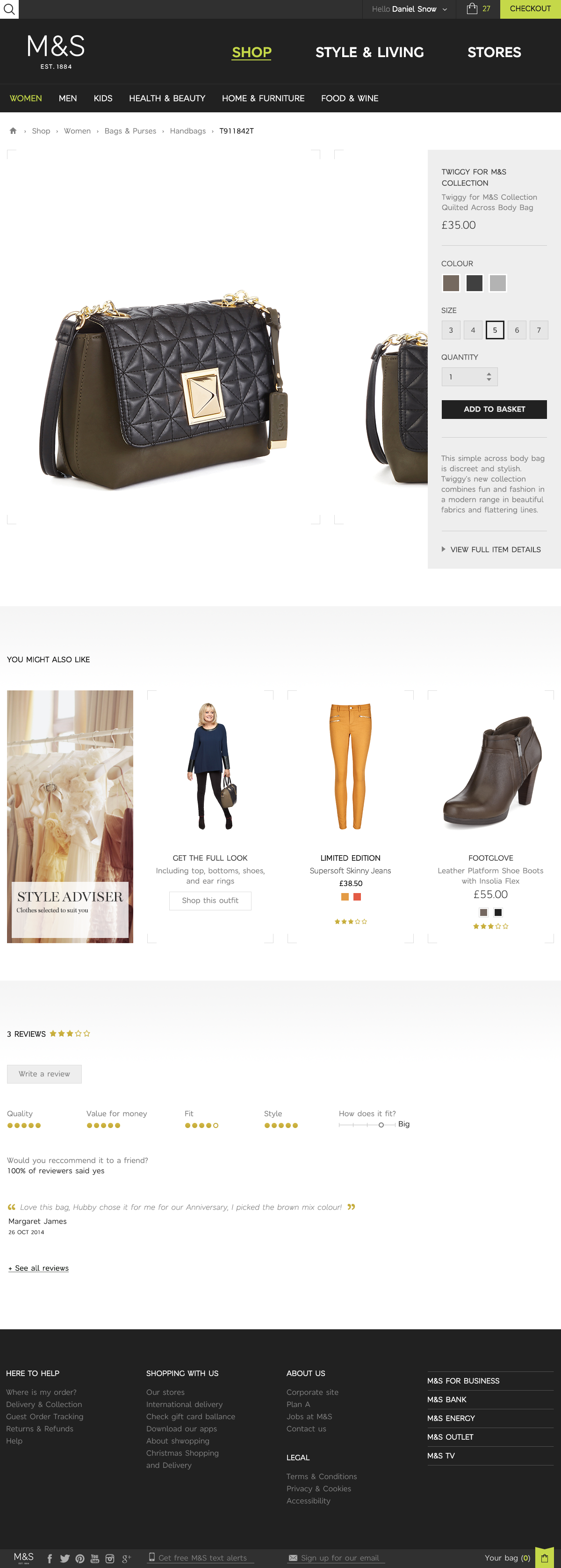
Product detail
The product detail page is broken down in to three areas - product imagery / control panel, you may also like, and reviews. The page keeps all current content on the site at the minute, but now has consistent design and functionality across all screen sizes.
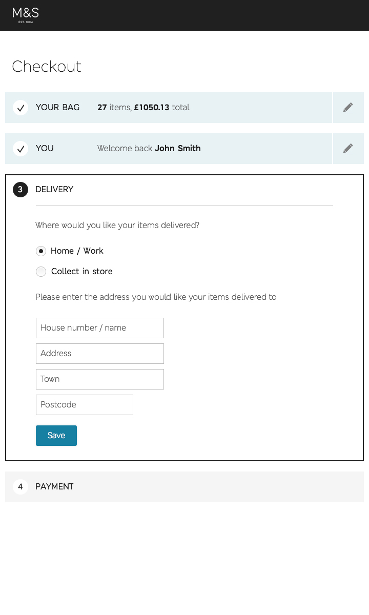
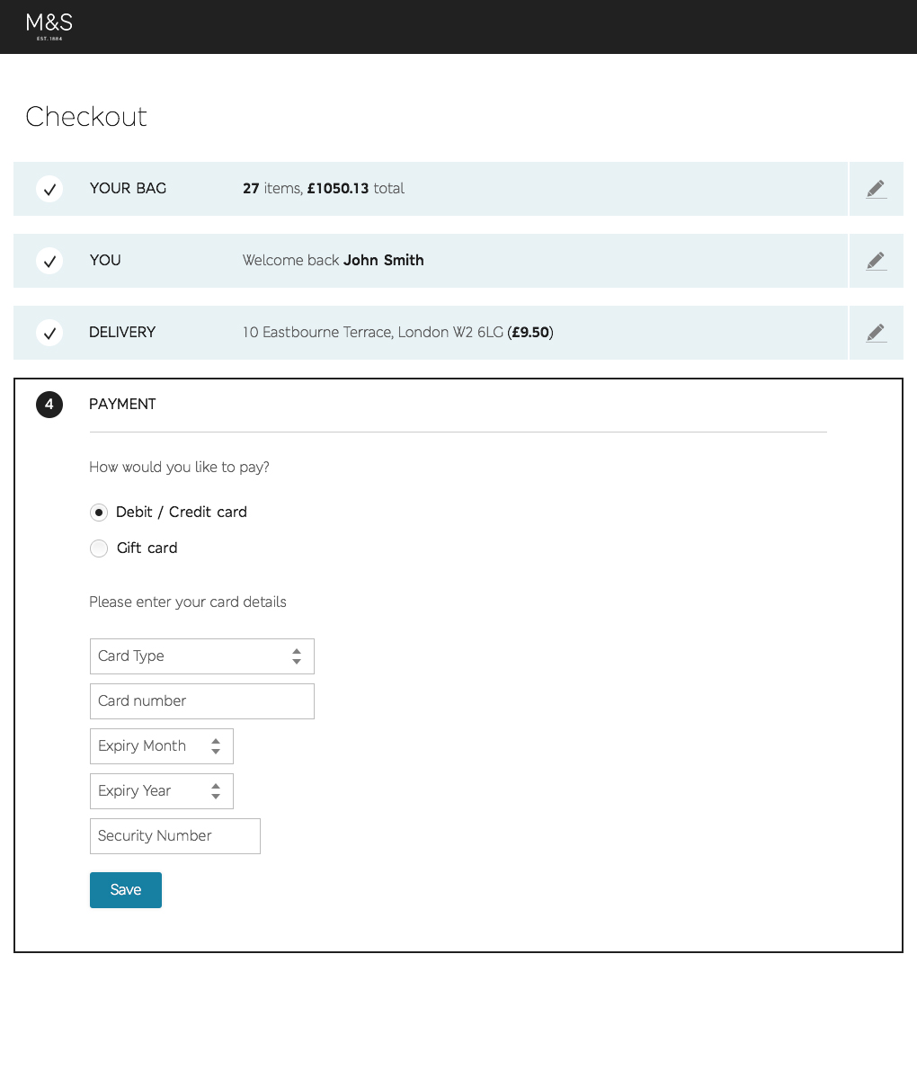
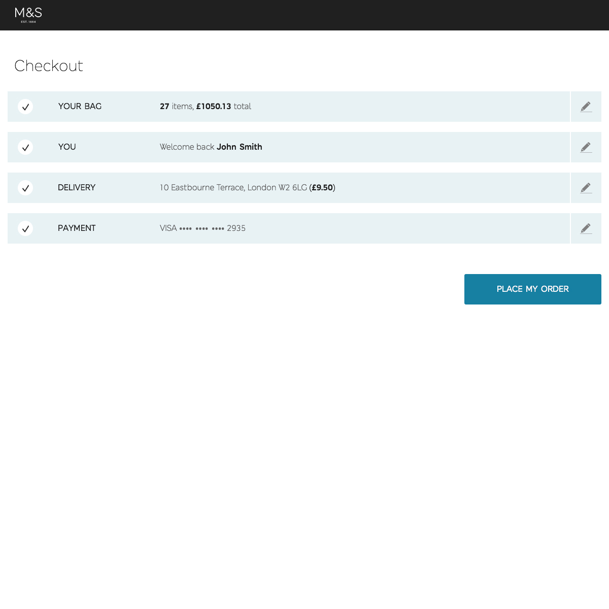
Checkout
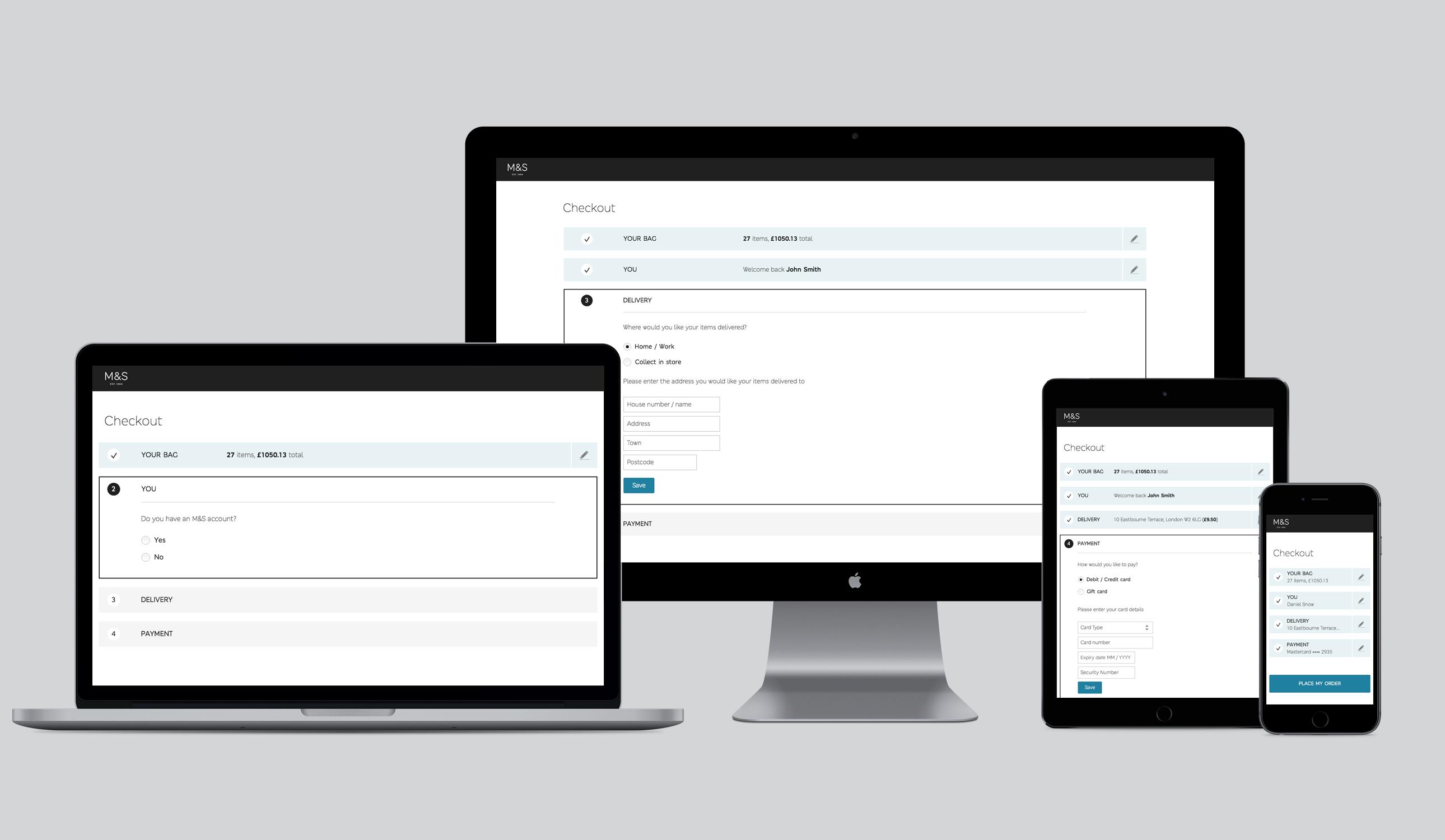
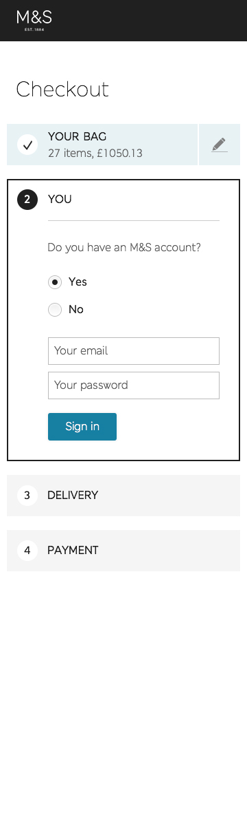
The checkout section is now on one page. It has been simplified to reduce dropout, and designed to work across all screen sizes. If a user is signed in and has bought from M&S before, they will be able to checkout with only one click. It is broken in to four areas; your bag, you, delivery, and payment. Content is delivered in a tailored way, reducing the amount of noise on the page.
Industry
Retail
Product
Website
Marks & Spencer
Marks & Spencer used to have a mobile site, a tablet site, a desktop site, and an in-store touch screen site. Each site had a different navigation, design, and user experience. I was tasked with reviewing all of the existing design and UX across all devices, then putting forward a new fully responsive proposal, incorporating a new brand guideline.
The brief
The brief was to take one complete user journey and find a consistent UX and design approach that worked across all screen sizes and devices, from 360 mobile up to 1920 in store touch screen.
Navigation
The primary navigation has three sections; Shop, Style & Living, and Stores. As there are only three sections they don’t need to be hidden behind a burger menu, they can be viewable at all times.
Under the shop section, there are a further six sub navigation areas; Women, Men, Kids, Health & Beauty, Home & Furniture, and Food & Wine. These six sub navigation links are fully viewable from tablet portrait, so do not need to be hidden behind a burger menu, or scrolled. All other content is linked to on-page.
The header, navigation and sub navigation are consistent across all screen sizes. The sub navigation only needs to be hidden behind a burger menu on a mobile phone screen.
Search, Account, Shopping Bag, and Checkout are all in the same location, the same size, and function the same across all screen sizes.
Homepage
The homepage now consists of only four parts. The feature area, shop, style & living, and stores. They are separated in to clear, easy to digest vertical chunks of information. The user scrolls from one part to the next. The feature area will tie in with current marketing material. The user can click straight through to the main shop categories, therefore skipping a page in the user journey. They can browse the latest Style & Living editorial, or find a Store. A logged in user that has bought from M&S before can now go from home to checkout in only five clicks.
Shop
The shop section is product focused, allowing users to find what they are looking for quickly and easily, with minimal distraction.
The landing page will act as a directory / site map of the shop area, but it can be skipped if a user clicks on a main shop category
on the homepage. From here a user can skip the next two pages of the sitemap, and jump straight to a product listing page.
Women
There are four keys areas, plus shop by brand, and be inspired. Each area lists the main product categories. From here a user can jump straight to a product listing page and skip the next page in the site map. This page has space for two promo messages within each key area, and three separate promo areas.
Product listing
The product listing page keeps all of the current content on the site at the minute. The filters are collapsed on screen sizes lower than 960.
The page has one column up to 600, two columns up to 960, three columns up to 1200, four columns up to 1860, and six columns above that.
Each product item area has a set of rules, a minimum and maximum size before reaching a breakpoint.
Product detail
The product detail page is broken down in to three areas - product imagery / control panel, you may also like, and reviews. The page keeps all current content on the site at the minute, but now has consistent design and functionality across all screen sizes.
Checkout
The checkout section is now on one page. It has been simplified to reduce dropout, and designed to work across all screen sizes. If a user is signed in and has bought from M&S before, they will be able to checkout with only one click. It is broken in to four areas; your bag, you, delivery, and payment. Content is delivered in a tailored way, reducing the amount of noise on the page.